Wheatseeds - Machine Learning Classifiers
Description of data: This data was acquired from the ‘UCI Center for Machine Learning’ repository. It contains seven variables for three distinct types of wheat kernels:
(Kama, Rosa, Canadian) designated as numerical variables 1, 2 & 3 respectively. The seven seed variables are:
- Area
- Perimeter
- Compactness
- Kernel Length
- Kernel Width
- Asymmetry Coefficient
- Kernel Groove Length
The last column is reserved for the Kernel type. This particular dataset has 199 entries. Some of these variables are explicitly dependent. For example, compactness: C = 4piArea/(Perimeter)^2 has a linear proportional relationship with area, and also a square proportionality with kernel width. Lets take a look at a summary of the dataset:
seeds_df <- read.csv(file = "../../../seeds.csv", header = T)
summary(seeds_df)
## Area Perimeter Compactness Kernel.Length
## Min. :10.59 Min. :12.41 Min. :0.8081 Min. :4.899
## 1st Qu.:12.33 1st Qu.:13.47 1st Qu.:0.8571 1st Qu.:5.267
## Median :14.43 Median :14.37 Median :0.8734 Median :5.541
## Mean :14.92 Mean :14.60 Mean :0.8708 Mean :5.643
## 3rd Qu.:17.45 3rd Qu.:15.80 3rd Qu.:0.8868 3rd Qu.:6.002
## Max. :21.18 Max. :17.25 Max. :0.9183 Max. :6.675
## Kernel.Width Asymmetry.Coeff Kernel.Groove Type
## Min. :2.630 Min. :0.7651 Min. :4.519 Min. :1.000
## 1st Qu.:2.954 1st Qu.:2.5700 1st Qu.:5.046 1st Qu.:1.000
## Median :3.245 Median :3.6310 Median :5.228 Median :2.000
## Mean :3.266 Mean :3.6992 Mean :5.421 Mean :1.995
## 3rd Qu.:3.564 3rd Qu.:4.7990 3rd Qu.:5.879 3rd Qu.:3.000
## Max. :4.033 Max. :8.3150 Max. :6.550 Max. :3.000length(seeds_df[,1])## [1] 199Goal:
We will perform some exploratory and descriptive analysis. The goal of this analysis is to determine which variables are pertinent for classification. Furthermore, we will compare two distinctly different ML methods for classifying our Kernels: Random Forest, and Support Vector Machines.
Exploratory and Descriptive Analysis:
After importing our CSV file as a dataframe, we can use the plot function to plot all variriables color coded by seed type.
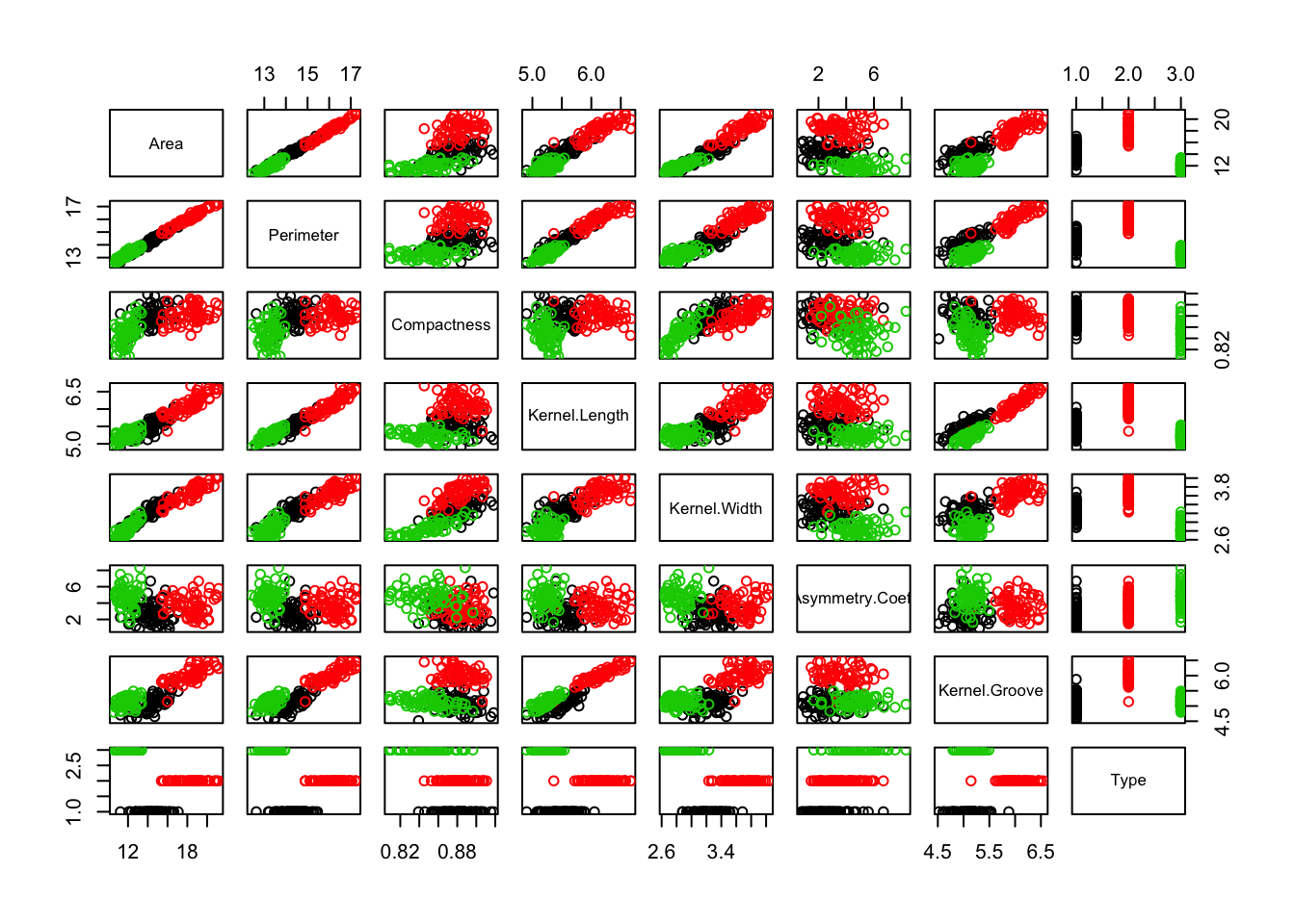
We can see some pretty discernable clustering with respect to area and perimeter. We can dig in a little deeper and use ggplot’s density function to observe the distribution of area for each seed type. Note that we convert the seed type to a factor, since ggplot sometimes doesn’t play well with mapping continuous variables to color.
library(ggplot2)
seeds_df$TypeFac <- as.factor(seeds_df$Type)
ggplot(seeds_df, aes(x = Area, color = TypeFac, fill = TypeFac)) + geom_density(alpha = 0.2) + theme_minimal()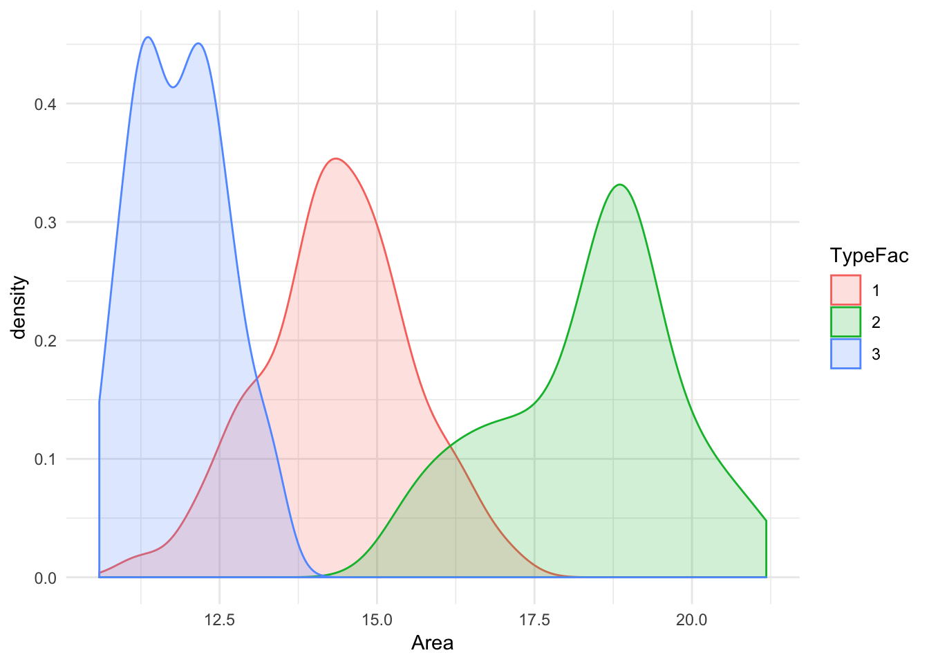 It’s apparent that the center of distributions for all three types are spaced noticeably apart. There is marginal overlap between the Types 1 & 2, and Types 2&3 although there is very minimal overlap between 1&3. Lets plot the same for Asymmetry Coefficient, along with a color coded scatter-plot for Asymmetry Coefficient vs Kernel Length :
library(gridExtra)
seeds_df$TypeFac <- as.factor(seeds_df$Type)
p1 <- ggplot(seeds_df, aes(x = Kernel.Groove, color = TypeFac, fill = TypeFac)) + geom_density(alpha = 0.2) + theme_minimal()
p2 <- ggplot(seeds_df, aes(x = Kernel.Groove, y = Kernel.Length, color = TypeFac)) + geom_point() + theme_minimal()
grid.arrange(p1,p2, ncol = 1)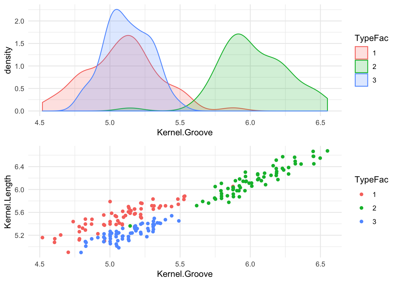 There seems to exist a significant overlap between the distribution of seed types 1 & 3, but there is almost no overlap between those two and the distribution for type 2. If we look at the color coded scatter plot, we can tell that the three clusters are segregated particularly well in the ‘Kernel Groove’ - ‘Kernel Length’ plane. This would be an optimal scenario to use Support Vector Machines, since the underlying mechanism of SVM works by seperating each category via decision boundary lines. It’s practical to note that while the density distribution plot (which is similar a smoothed ‘continuous’ histogram), can tell us a lot about a particular variable in the data set it is not always the best visual aid to guage the independent variables to use in your ML algorithm.
Since we’re planning on working with an SVM algorithm, lets take a look at some scatter plots, and see if we can discern some notable boundaries like before:
plot1 <- ggplot(seeds_df, aes(x = Kernel.Groove, y = Perimeter, color = TypeFac)) + geom_point() + theme_minimal() +theme(legend.position="none")
plot2 <- ggplot(seeds_df, aes(x = Asymmetry.Coeff, y = Perimeter, color = TypeFac)) + geom_point() + theme_minimal() +theme(legend.position="none")
plot3 <- ggplot(seeds_df, aes(x = Kernel.Width, y = Compactness, color = TypeFac)) + geom_point() + theme_minimal() +theme(legend.position="none")
plot4 <- ggplot(seeds_df, aes(x = Kernel.Length, y =Compactness, color = TypeFac)) + geom_point() + theme_minimal() +theme(legend.position="none")
grid.arrange(plot1,plot2,plot3,plot4, ncol = 2)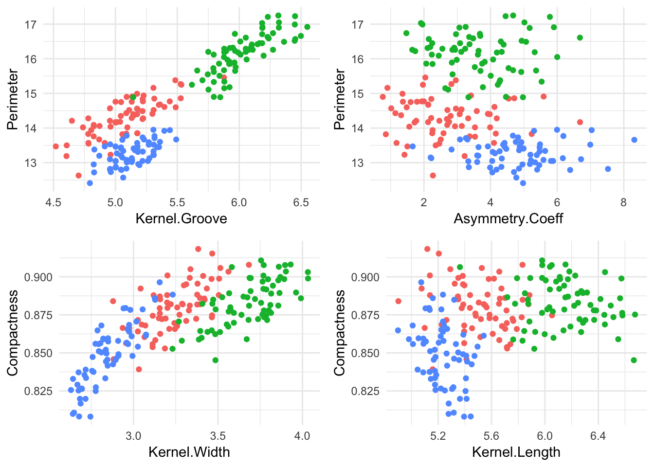 The most visible seperation we can note is on the ‘Kernel Groove - Perimeter’ plane, and the ‘Compactness - Kernel.Width’ plane. Lets train our SVM model to classify seed type based off of ‘Kernel Groove’, ‘Kernel Length’, ‘Asymmetry Coeff’ and ’Perimeter. We’ll start by randomly splitting our dataset into a training and test set.
SampleIndex <- sample(1:nrow(seeds_df), 145)
seeds_training <- seeds_df[SampleIndex,]
seeds_testing <- seeds_df[-SampleIndex,]
library(e1071)
Now we create an SVM object, we skip the parameter tuning for now and print a confusion matrix
set.seed(151)
svm_model <- svm(Type ~  Kernel.Length + Kernel.Groove + Perimeter + Asymmetry.Coeff, data = seeds_training, scale = FALSE)
actual <- seeds_training$TypeFac
table(round(svm_model$fitted), actual)
## actual
## 1 2 3
## 1 43 1 1
## 2 6 48 5
## 3 2 0 39Hey! An 89% Accuracy is not too shabby, of course we can go ahead and add the rest of the variables or see if we can push the accuracy by tuning our model. Let’s go with the latter:
tunesvm <- tune(svm, kernel = "radial", data = seeds_training, Type ~ Kernel.Length + Kernel.Groove + Perimeter + Asymmetry.Coeff, ranges = list(epsilon = seq(0,.5,0.1), cost = 2^(1:7)))
plot(tunesvm)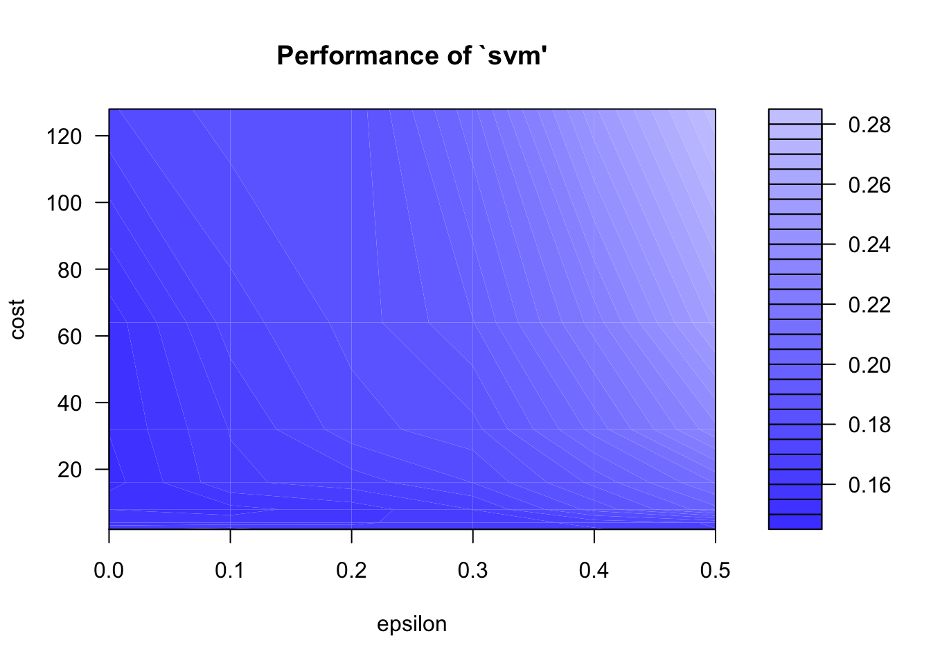
svm_model <- tunesvm$best.modelLet’s print a confusion matrix:
table(round(svm_model$fitted), actual)## actual
## 1 2 3
## 1 45 0 0
## 2 6 49 2
## 3 0 0 43That’s marginally better, but we see that if we blindly add the rest of the coefficients we get a very accurate model (at least for the training set):
svm_model2 <- svm(Type ~., data = seeds_training)
table(round(svm_model2$fitted), seeds_training$Type)
##
## 1 2 3
## 1 51 0 0
## 2 0 49 0
## 3 0 0 45Wow 100%! Lets see how this model fares with our testing set! Using the predict() function, we can predict the outcomes of our testing set based on the ‘svm_model’ object.
table(round(predict(svm_model2,seeds_testing)), seeds_testing$Type)##
## 1 2 3
## 1 15 0 0
## 2 0 19 0
## 3 0 0 20Our results are spot-on. Lets compare this method to random forest just for fun.
library(randomForest, warn.conflicts = FALSE,quietly = TRUE)## randomForest 4.6-14## Type rfNews() to see new features/changes/bug fixes.seeds_training$Type <- as.factor(seeds_training$Type)
rf1 <- randomForest(Type ~., data = seeds_training, ntree = 100, mtry = 6)
plot(rf1)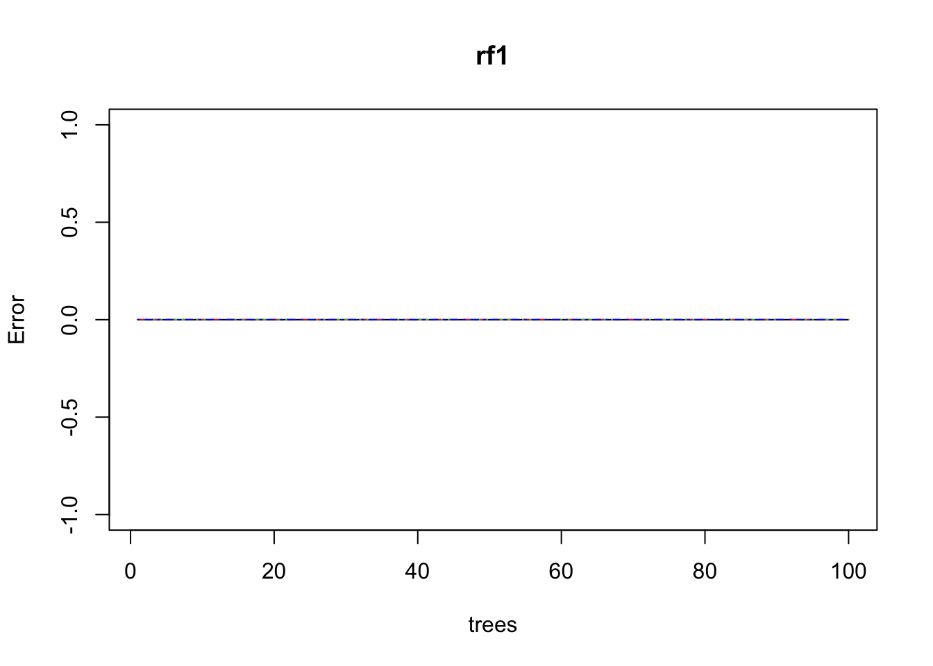
table(rf1$predicted, seeds_training$Type)##
## 1 2 3
## 1 51 0 0
## 2 0 49 0
## 3 0 0 45Wow, random forest gave us spot on results without having to tune our ML model. Let’s see how the testing set turns out.
table(predict(rf1, seeds_testing), seeds_testing$Type)##
## 1 2 3
## 1 15 0 0
## 2 0 18 0
## 3 0 1 20Perfect!