PAC12 Football: A Cursory Visual Analysis
Introduction
While I’m still contemplating what my next blog-post should cover, I thought it would be neat to do a cursory analysis on my alma mater’s football team.
Washington State (WSU) has had a successful year in terms of football (and I’m sure academically as well), this season has produced the school’s most “winningest” team and at one point was ranked No. 7 in the AP Poll. A considerable amount of my fascination for WSU is not only the “Air Raid Offense”, (which is in my opinion one of the most complex and effective ways to move the ball downfield) but is also due to Mike Leach. Mike Leach and his colleague Hal Mumme were the topic of a 2016 book aptly titled: “The Perfect Pass” written by S.C Gwynne (of Moneyball Fame) which details their creation of the “Air Raid Offense”. He is most definitely an interesting character with an enduring curiosity for a variety of odd subjects (See the books: “Swing Your Sword” & “Geronimo”, which are both penned by him ).
There’s loads of sources for football stats, and tables so I though some exploratory analysis about WSU’s most successful season would make a neat post. The bulk (if not all), of my data will be coming from Here. I’ll put a download link to the csv file if you should find yourself curious. I’ll be using ggplot and plotly, to construct some interactive data visualization schemes that will shed some insight about this season. Most of the focus will be on WSU’s standing among other Pac-12 teams in a variety of football metrics.
Let’s start by loading our dataframe. I’ve combined all of the PAC-12 teams into a single dataframe, and joined their respective defensive and offensive metrics like so:
library(plotly,verbose = F,quietly = T,warn.conflicts = F)
Pac12 <- read.csv("~/Desktop/Untitled spreadsheet - Sheet1.csv", stringsAsFactors = T, header = T)
library(DT)
str(Pac12[,1:12])
## 'data.frame': 153 obs. of 12 variables:
## $ Team : Factor w/ 12 levels "Arizona","Arizona State",..: 12 12 12 12 12 12 12 12 12 12 ...
## $ X : Factor w/ 2 levels "AWAY","HOME": 1 2 2 1 2 1 2 1 2 1 ...
## $ Opponent : Factor w/ 48 levels "Arizona","Arizona State",..: 48 36 11 37 44 32 31 39 6 9 ...
## $ Result : Factor w/ 2 levels "L","W": 2 2 2 1 2 2 2 2 2 2 ...
## $ OffensivePassing.Cmp: int 38 35 51 37 31 30 39 40 35 37 ...
## $ OffensivePassing.Att: int 57 54 65 52 56 40 51 50 51 61 ...
## $ OffensivePassing.Pct: num 66.7 64.8 78.5 71.2 55.4 75 76.5 80 68.6 60.7 ...
## $ OffensivePassing.Yds: int 319 420 524 344 445 430 323 438 334 346 ...
## $ OffensivePassing.TD : int 3 3 3 3 3 5 4 3 1 2 ...
## $ OffensiveRushing.Att: int 21 31 15 24 10 22 24 19 15 33 ...
## $ OffensiveRushing.Yds: int 75 124 41 91 13 100 77 59 79 131 ...
## $ OffensiveRushing.Avg: num 3.6 4 2.7 3.8 1.3 4.5 3.2 3.1 5.3 4 ...Data Visualization
Let’s find out where WSU stands in “Offensive Yards”“,”Passing Yards“, and”First Downs“.
library(plotly, quietly = T, warn.conflicts = F)
p1 <- ggplot(Pac12, aes(x = OffensiveTotal.Offense.Yds, y = OffensivePassing.Yds, color = Team, size = OffensiveFirst.Downs.Tot, text = Opponent)) + geom_point() + scale_color_manual(values = c("Washington State" = "#D12323", "Washington" = "#6C07C4","Utah" = "#F76B5F","UCLA" = "#294DD5","Stanford" = "#000000", "Southern California" = "#A2A719","Oregon State" = "#E38214","Oregon" = "#13DC2E", "Colorado" = "#939393", "California" = "#78A2F2", "Arizona State" = "#D17083", "Arizona" = "#1F009D"))
ggplotly(p1)FYI: This plot is completely interactive! You should be able to touch the legend and (in/ex)-clude teams in the conference, and hover over (or touch) the points on the scatter plot to obtain more information.
As we see, WSU is head and shoulders above most of the conference in passing yards and on par with regards to total offense yards. Total offensive yards scales pretty well with first downs, so WSU is in pretty good shape there as well. You might say, “Scales Well?, what do you mean by that?” Well, its just a vague generalization but it’s mostly true. The more you move the ball the more offensive yards you gain, and in turn the more first downs you’ll obtain. Yes this omits first down by penalties, but like I said, it’s just a generalization. This generalization is further validated by UCLA’s point size, and total offensive yards in the lower right hand corner. They were abysmal for most of this season.
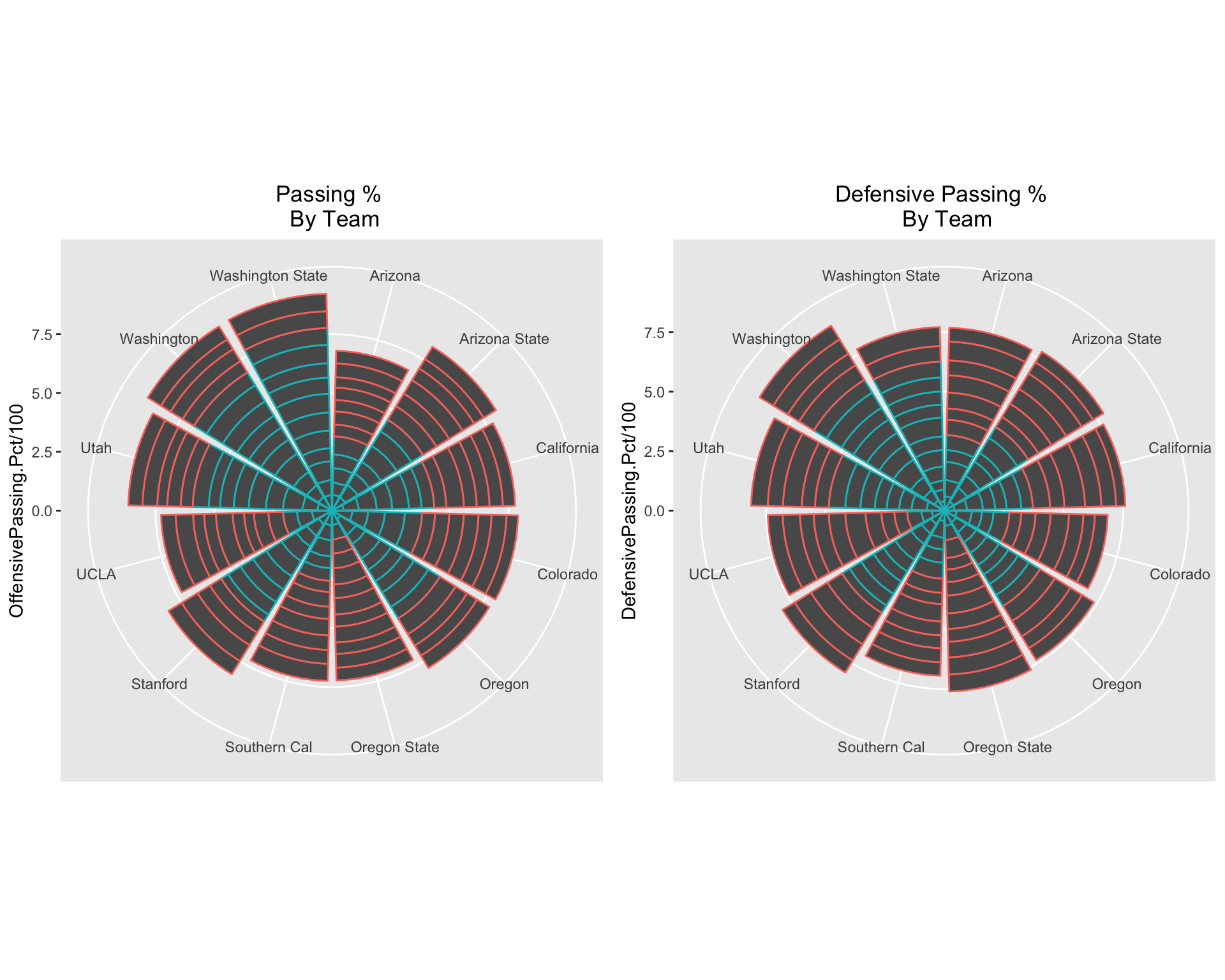
Alright, they pass a lot, and they move the ball a lot, but how do their pass completions rank amongst the rest of the Pac-12? I could use a boring old bar graph to illustrate the data, or I could use a fancy schmancy polar bar plot. I’ll proceed with the latter, and I’ll use the package gridExtra to arrange the plots next to each other:
library(gridExtra, warn.conflicts = F)
p2 <- ggplot(Pac12, aes(x = Team, y = OffensivePassing.Pct/100, color = Result)) + geom_col() + coord_polar() +theme(legend.position = "none", axis.title.x=element_blank(), plot.title = element_text(hjust = 0.5)) + ggtitle("Passing % \n By Team")
p3 <-  ggplot(Pac12, aes(x = Team, y = DefensivePassing.Pct/100, color = Result)) + geom_col() + coord_polar() +theme(legend.position = "none", axis.title.x=element_blank(), plot.title = element_text(hjust = 0.5)) + ggtitle("Defensive Passing % \n By Team")


grid.arrange(p2, p3, ncol = 2) 
The turquoise and orange, indicate wins and losses respectively.
Typically, to get the complete passing percentage per season you would sum the completed passes and divide by the attempted passes. This is unnecessary though, since all the teams played the same number of games, and we’re interested in the completed pass percentage for each game. For the left plot, it turns out that WSU is better than UW by only an infinitesimal amount (if any at all).
The plot on the right gives us the “Defensive Passing Percentage” which is the passing percentage of the opposing team, and again the sum of all the percentages in the season. This is a good measure of how much a team breaks up passes, intercepts, or rushes the QB forcing a “throw away”. It seems like USC and Colorado are solid in that regard.
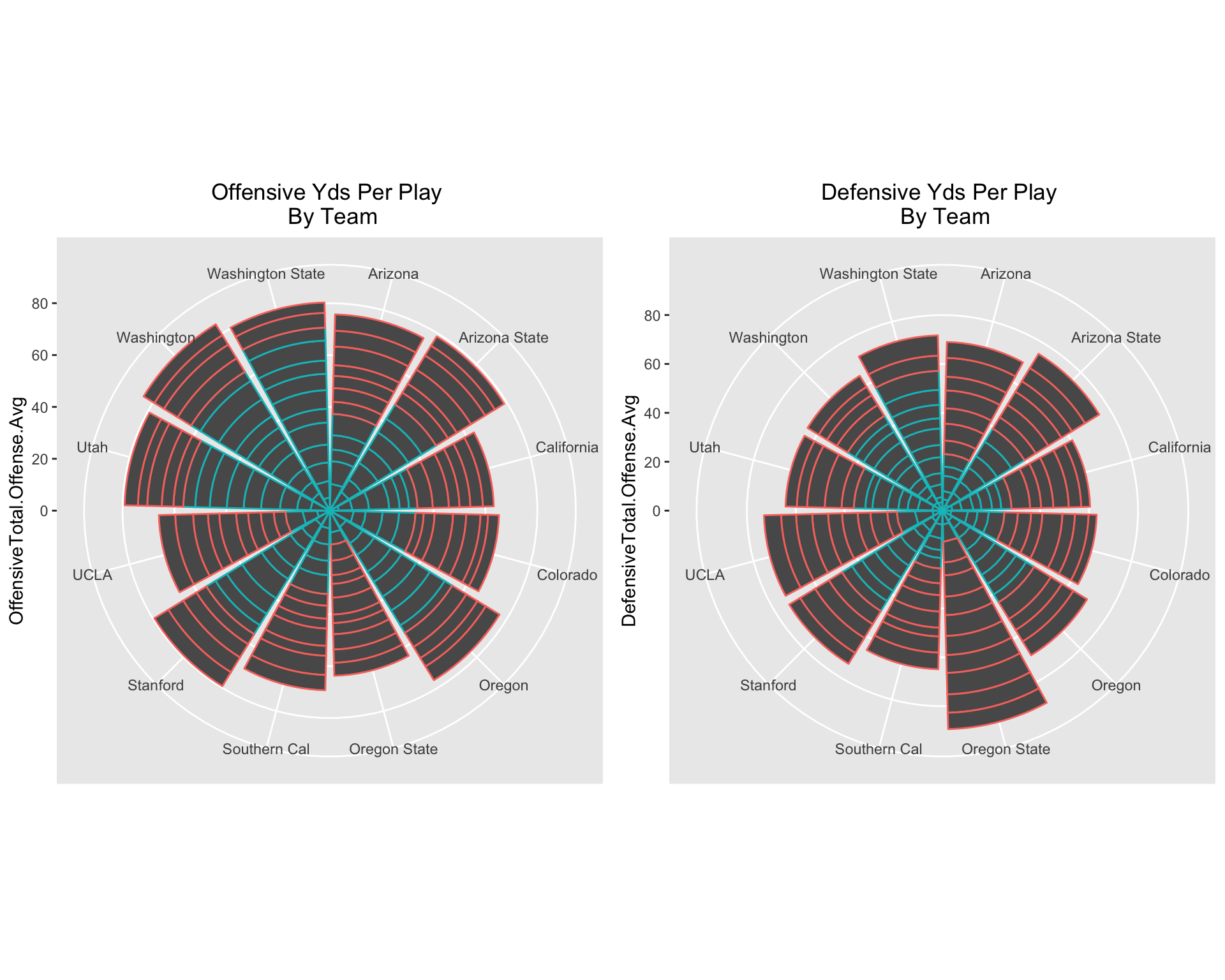
Let’s look at the offensive and defensive average yards per play.
library(gridExtra, warn.conflicts = F)
p2 <- ggplot(Pac12, aes(x = Team, y = OffensiveTotal.Offense.Avg, color = Result)) + geom_col() + coord_polar() +theme(legend.position = "none", axis.title.x=element_blank(), plot.title = element_text(hjust = 0.5)) + ggtitle("Offensive Yds Per Play \n By Team")
p3 <-  ggplot(Pac12, aes(x = Team, y = DefensiveTotal.Offense.Avg, color = Result)) + geom_col() + coord_polar() +theme(legend.position = "none", axis.title.x=element_blank(), plot.title = element_text(hjust = 0.5)) + ggtitle("Defensive Yds Per Play \n By Team")

grid.arrange(p2, p3, ncol = 2) 
Oregon state was in very bad shape this season, and this graph definitely illustrates why. Not only do they have the least amount of average yards per play, but they gave up significantly more yards than any other team in the Pac-12.
Let’s take a look at Penalties exclusively between Pac-12 Teams.
Pac12Exc <- as.data.frame(Pac12[Pac12$Opponent %in% Pac12$Team,])
penal.plot <- ggplot(Pac12Exc, aes(x =Team, y =Opponent, fill = OffensivePenalties.No. ) ) + geom_tile() + theme(axis.text.x = element_text(angle = 35, hjust = 1))+ ggtitle("Penalties Per Game")
penal.plot2 <- ggplot(Pac12Exc, aes(x =Team, y = OffensivePenalties.No., text = Opponent, fill =  OffensivePenalties.No.)) + geom_col() + theme(axis.text.x = element_text(angle = 35, hjust = 1))+ ggtitle("Total Penalties (2018 Season)")
Arizona and Southern California have considerably more penalties than most of the other Pac-12 teams. It is also worth pointing out that USC is responsible for a controversial missed targeting call that was challenged and eventually overturned by unqualified executive personell at the Pac-12 headquarters. Afterwards, Larry Scott and the Pac-12 issued a PR statement accepting all the blame, and promising to restructure their instant replay procedures. This led to a barrage of articles by The Orgonian Detailing Faults in Pac-12 management.

USC’s Porter Gustin’s missed targeting call against WSU’s Gardner Minshew
Gardner Minshew has become a legend in Pullman. The Minshew stache has become a staple of game attendees, and students throughout the 2018 season. Since he’s entering the draft this season along notable prospects like Kyler Murray, it’s worth taking a look at his metrics this season. We’ll include QBs from other top-25 teams in the AP poll, and the better performing QBs from the Pac-12 as well.
QBs <- read.csv(file = "../../../Players.CSV", header = T, stringsAsFactors = T)
str(QBs)
## 'data.frame': 23 obs. of 11 variables:
## $ Team : Factor w/ 23 levels "Alabama","Army",..: 22 21 3 20 1 4 19 12 13 10 ...
## $ Player : Factor w/ 23 levels "Chase Garbers",..: 4 5 8 22 21 1 9 10 7 2 ...
## $ Passing.Cmp : int 468 252 224 149 245 159 216 240 140 373 ...
## $ Passing.Att : int 662 388 369 233 355 260 363 404 224 533 ...
## $ Passing.Pct : num 70.7 64.9 60.7 63.9 69 61.2 59.5 59.4 62.5 70 ...
## $ Passing.Yds : int 4776 3192 2794 1762 3966 1511 2672 3151 1660 4831 ...
## $ Passing.Y.A : num 7.2 8.2 7.6 7.6 11.2 5.8 7.4 7.8 7.4 9.1 ...
## $ Passing.AY.A: num 7.8 7.9 7.9 7.4 12.8 5.2 6.9 8.3 7.5 10.3 ...
## $ Passing.TD : int 38 16 18 12 43 14 14 29 10 50 ...
## $ Passing.Int : int 9 10 5 6 6 10 10 8 4 8 ...
## $ Passing.Rate: num 148 142 138 139 199 ...Let’s plot passing % vs passing yards, with 100/(Interception). Why 100/INT? because we want the QBs with the larger amount of interceptions this year to be smaller, and because 1/INT gave point sizes that were too small.
QB.plot1 <- ggplot(QBs, aes(x = Passing.Yds, y = Passing.Pct, size = (100/Passing.Int), color = Player)) + geom_point()
ggplotly(QB.plot1)