Lordsburg Probe Study
Introduction
Objective
In the middle of March, we deployed 25 temperature data loggers to Lordsburg NM, with the intention of identifying locations on recently acquired land that may suffer from recurring freezing after budbreak. Spring Frost or Freeze Damage can be detrimental to your crop yield, by killing off some of the buds that have recently emerged, and in some cases potentially delays further development in trees that haven’t reached budbreak.
While there isn’t a universally accepted set of criteria that categorizes a “detrimental crop freeze”, we can look at certain freezing events (where the temperature drops below 0) that occur after budbreak, at multiple points on the area of interest and affix supplemental geographical data. So in short, our objective is to locate probes with the highest freeze count shortly after budbreak, find the duration of freezes, as well as the severity of coldness, while also attempting to identify any correlation with geographical data.
Method
We purchased and configured 30 “Elitech GSP-6” data loggers to measure and record the ambient temperature every 15 minutes. Lordsburg New Mexico is near the southern boundary between New Mexico and Arizona. The area of interest (in decimal form) is about the point 32.23705 N, 108.606743 W and is pictured below:
## Source : https://maps.googleapis.com/maps/api/staticmap?center=32.237,-108.6042&zoom=14&size=640x640&scale=2&maptype=satellite&language=en-EN&key=xxx
We chose to install the data loggers in accessible locations near roads and highways on March 19th, 2019, affixing them to owl boxes. The locations and arbitrarily designated labels are displayed below.

It was imperative to install the temperature probes shortly before budbreak, which is able to be approximated through a calculation more closely detailed here in a paper by Darrell Sparks. In summary, we calculate the amount of chilling degree days (CDD) accumulated, which can be done by taking the difference between the daily mean ambient temperature, and the base temperature. We chose the base temperature of 45 degrees Fahrenheit, which was suggested by the literature previously mentioned. Subsequently, we can predict the number of heating degree days (HDD) until budbreak, utilizing the formula log(Y) = a -b*Sqrt(X), where Y is the number of heating degree days until budbreak, a and b are given curve fits, and X is the amount of accumulated chilling degree days since Dec 1st. Using data from nearby weather stations, we settled on budbreak occurring on April 7th.
We were able to retrieve 17 out of the 30 probes deployed. 13 out of the 30 probes either suffered severe damage prohibiting the data retrieval process, had suffered damaged during the relevant interval of time, or simply ceased to function. The faceted graph below shows the min and average temperatures for the probes that were still functional. We see that measurements for probe 12 around May 5th started becoming erratic, not following the trend of the surrounding probes, we simply crop out that segment of measurements.
Analysis
Results and Observations
dfsummary %>% ggplot(aes(x = ObsTime, y = MinTemp)) + geom_line( aes(color = "MinTemp")) + geom_line(aes(x = ObsTime, y = AvgTemp, color = "AvgTemp")) + facet_wrap(~ProbeNum) + theme(axis.text.x = element_text(angle = 25, hjust = 1))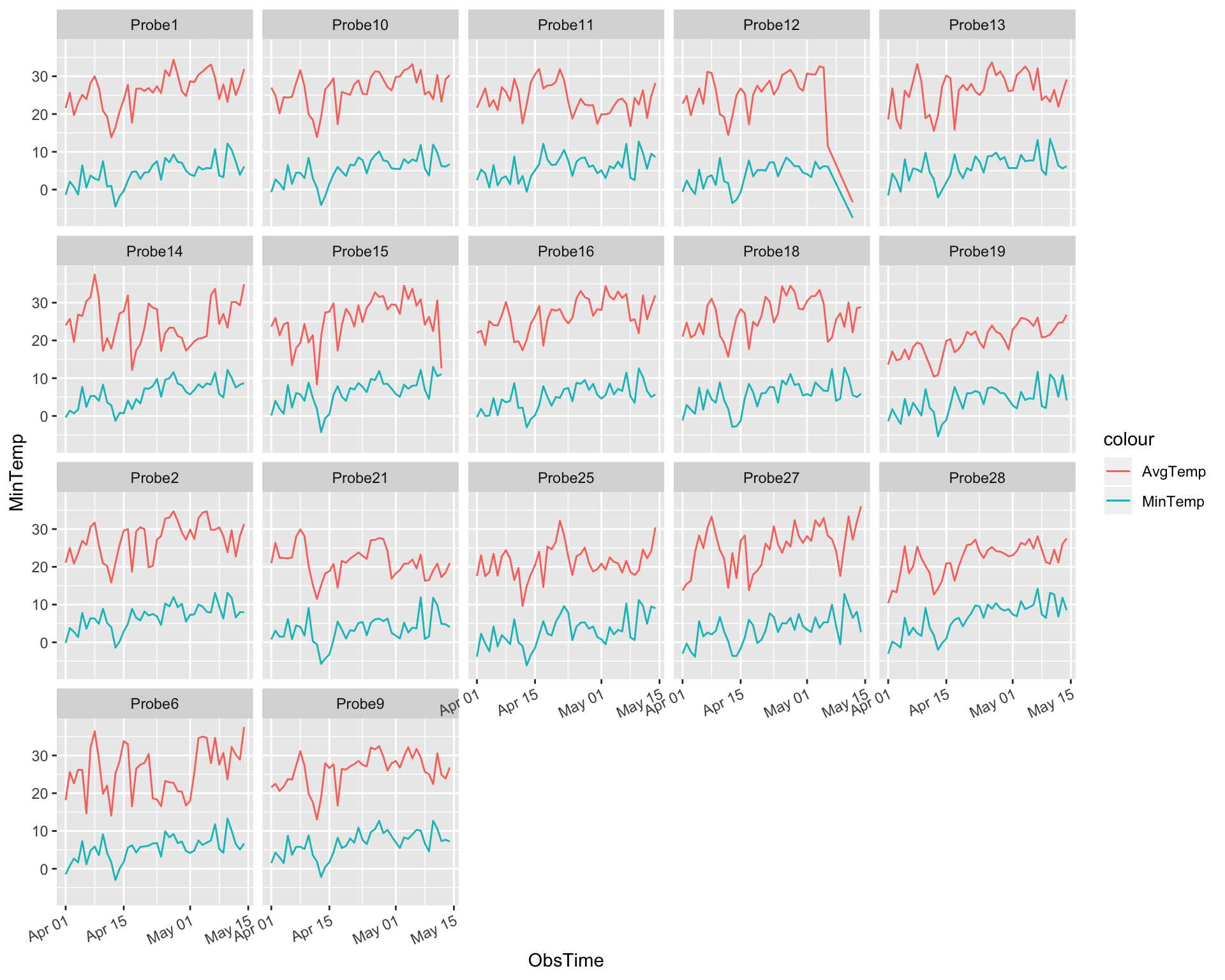
In the figure above, we note that all of the probes reach temperatures below zero after April 7th. We begin by getting the count of days each probe reached a minimum temperature of zero.
dfsummary %>% filter(MinTemp < 0) %>% group_by(ProbeNum) %>% count() %>% arrange(desc(n)) %>% ggplot(aes(x = reorder(ProbeNum, -n), y = n)) + geom_col() +theme(axis.text.x = element_text(angle = 25, hjust = 1)) + xlab(label = "Number of days Min Temp Dropped Below Freezing")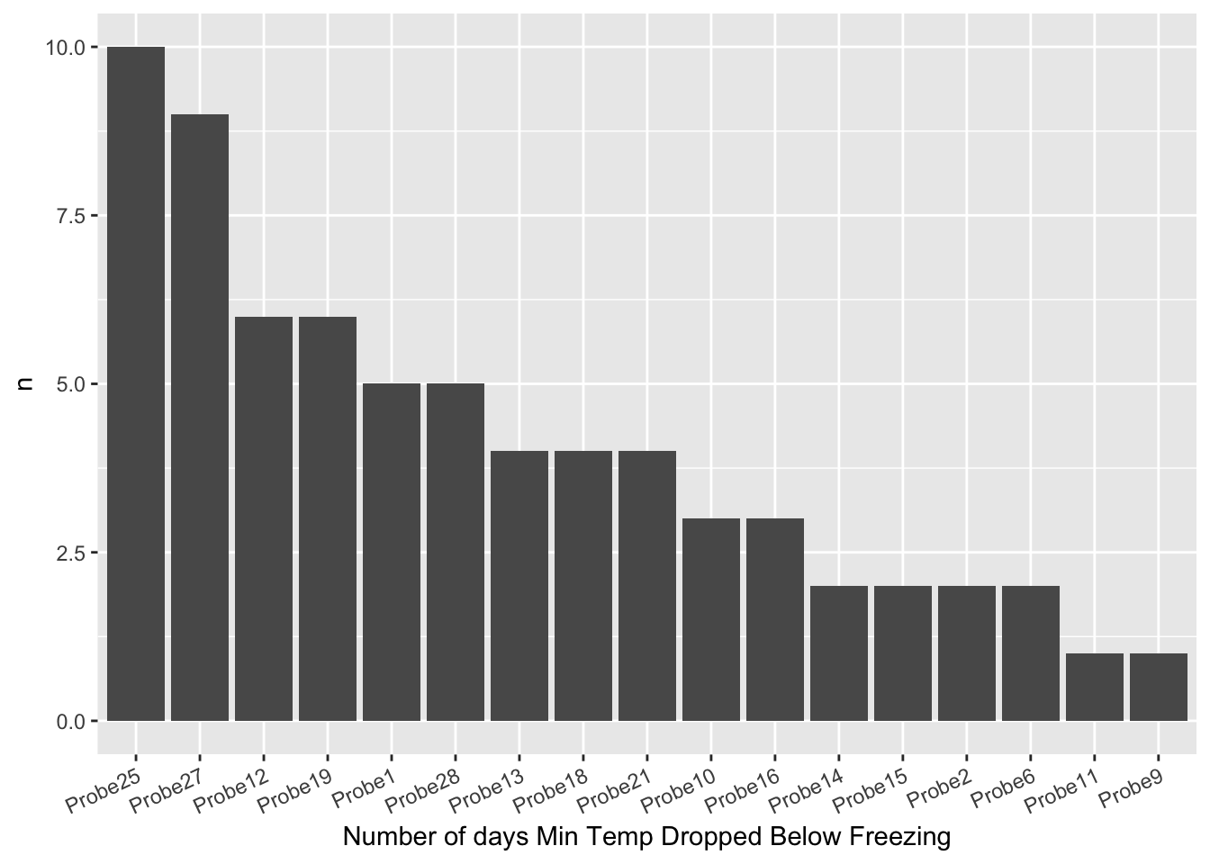
Probe 25 and 27 suffer from more frequent freezes. It would help to append the counts to the previously demonstrated aerial view of the land. This will give us an intuitive understanding of the regional frequency of freezes. We see that more frequent freezes occur in the north north-east portion of the land.

To see if there’s any correlation between latitude (north-south variation), and the count of days below freezing we visualize Lat Vs Freeze Count.
dfloc$Latbin <- round(dfloc$Lat, 2)
pq <- dfsummary %>% filter(MinTemp < 0) %>% group_by(ProbeNum) %>% count() %>% inner_join(dfloc, by = "ProbeNum") %>% ggplot(aes(Lat, n, size = n)) + geom_point() + theme(axis.text.x = element_text(angle = 25, hjust = 1)) + xlab(label = "Latitude Of Probe") + ylab(label = "Number Of Days Below Freezing") + labs(title = "Days below freezing by probe Latitude")

ggplotly(pq)
While our sample size is small (only 17 probes), we can see a notable correlation between the two. Is there any correlation between the severity of the freeze and latitude? Let’s bin the latitude by rounding it to 10^-2, and plotting a boxplot of each binned value.
##bin Lat##
dfloc$Elevationbin <- round(dfloc$Elevation, -1)
p1 <- dfsummary %>% filter(MinTemp < 0) %>% inner_join(dfloc, by = "ProbeNum") %>% ggplot(aes(x = as.factor(Latbin), y = MinTemp)) + geom_boxplot() + xlab(label = "Rounded Latitude")
p2 <- dfsummary %>% filter(MinTemp < 0) %>% inner_join(dfloc, by = "ProbeNum") %>% ggplot(aes(x = Lat, y = MinTemp)) + geom_point() + xlab(label = "Latitude")
grid.arrange(p1,p2, ncol = 1)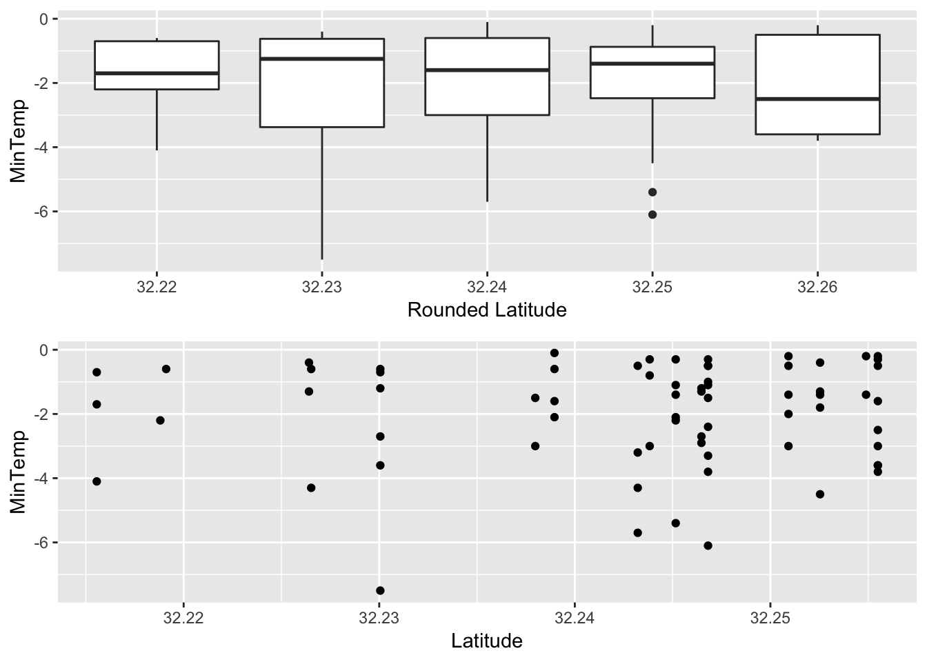 While we see sparser clusters of freezes for lower latitudes, we also see an indication of more frequent and colder freezes for probes with larger latitudes.
Rather than looking just at Latitude/Longitude, we thought it’d be worth looking at the estimated Elevation given by google earth. After joining this we see that there’s quite a large negative correlation. The elevation of our probes only varies about 23 meters, and seems to drop towards the north north-east direction.
pz <- dfsummary %>% filter(MinTemp <= 0) %>% group_by(ProbeNum) %>% count() %>% inner_join(dfloc, by = "ProbeNum") %>% ggplot(aes(as.factor(Elevation), n, size = Latbin)) + geom_point() + theme(axis.text.x = element_text(angle = 25, hjust = 1)) + xlab(label = "Elevation Of Probe (meters)") + ylab(label = "Number Of Days Below Freezing") + labs(title = "Days below freezing by probe Elevation")

ggplotly(pz)dfsummary %>% filter(MinTemp < 0) %>% group_by(ProbeNum) %>% count() %>% inner_join(dfloc, by = "ProbeNum") %>% .[,-1] %>% cor() %>% corrplot(method = "color", addCoef.col = "black" ,tl.col = "black")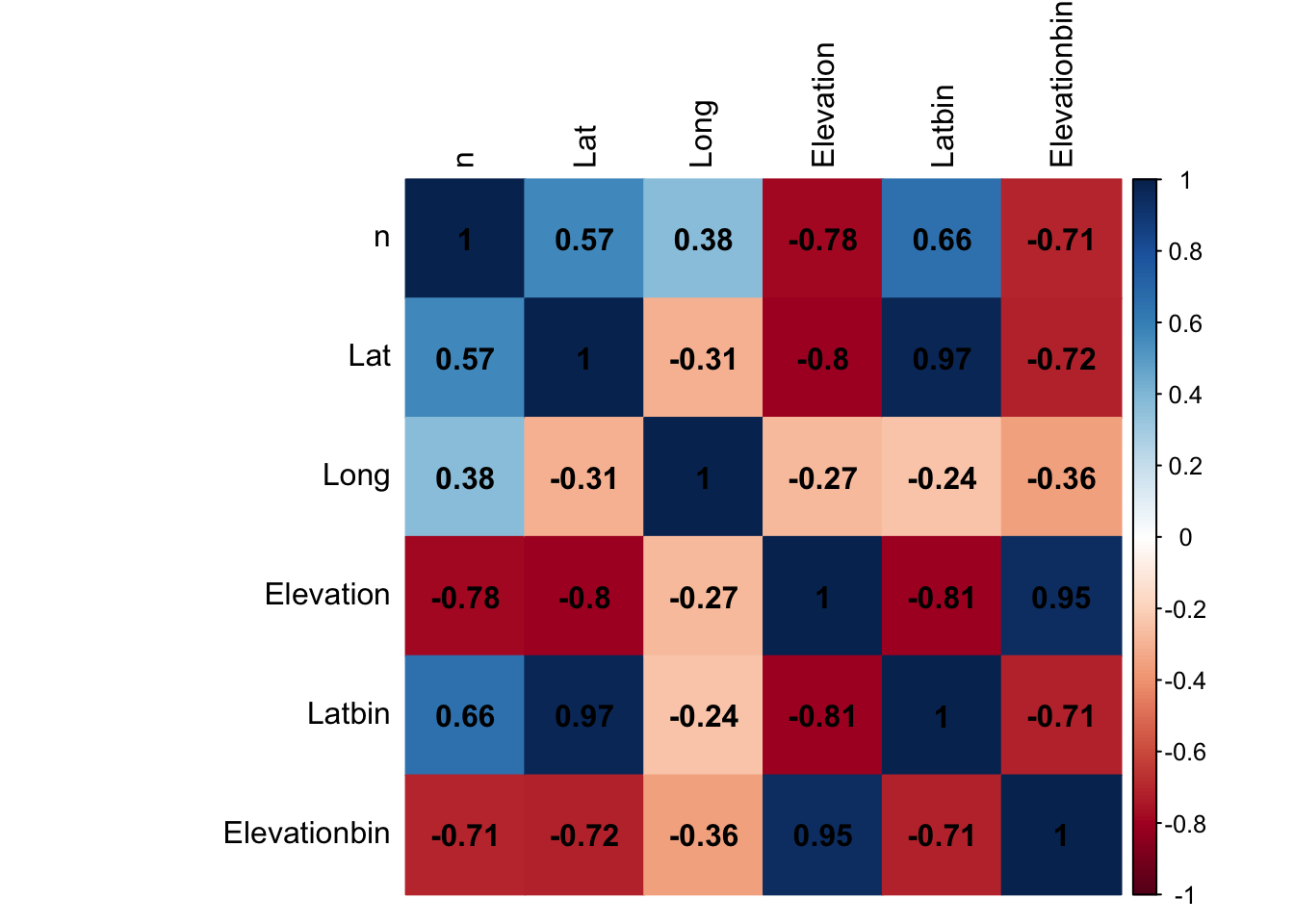 The above figure confirms our intuition, and informs us that elevation has a much stronger on the number of freezes during this time interval than latitude.
Freeze Duration
Another topic of interest would be freeze duration. For our pecan orchards, a subzero freeze that occurs briefly for a couple of hours is not as detrimental to our yield as freezes that occur for 6-7 hours. Therefore, it’s imperative to analyze the freeze durations from the data we’ve gathered. We can calculate the duration by grouping the entire data set by probe and date, and finding the time difference between the latest freeze time, and earliest freeze time using difftime.
Let’s bin the elevation to the nearest power of ten, and scatterplot the duration vs date, while color coding each binned elevation.
p1 <- df %>% filter(TempinC < 0) %>% group_by(ProbeNum,ObsTime) %>% summarize(FreezeStart = min(DateTime), FreezeEnd = max(DateTime)) %>% mutate(FreezeLength = as.numeric(difftime(FreezeEnd, FreezeStart, units = "hours"), units = "hours") + .25) %>% inner_join(dfloc, by = "ProbeNum") %>% mutate(Elevation = round(Elevation,-1)) %>% ggplot(aes(x = ObsTime, y = FreezeLength, color = as.factor(Elevation))) + geom_point() + xlab("Observation Date")
p2<- df %>% filter(TempinC < 0) %>% group_by(ProbeNum,ObsTime) %>% summarize(FreezeStart = min(DateTime), FreezeEnd = max(DateTime)) %>% mutate(FreezeLength = as.numeric(difftime(FreezeEnd, FreezeStart, units = "hours"), units = "hours") + .25) %>% inner_join(dfloc, by = "ProbeNum") %>% mutate(Elevation = round(Elevation,-1)) %>% ggplot(aes(x = ObsTime, fill = as.factor(Elevation))) + geom_bar()+ xlab("Observation Date")
grid.arrange(p1,p2, top = "Top: Freezelength by Day & Elevation. Bottom: Freeze count by Day & Elevation")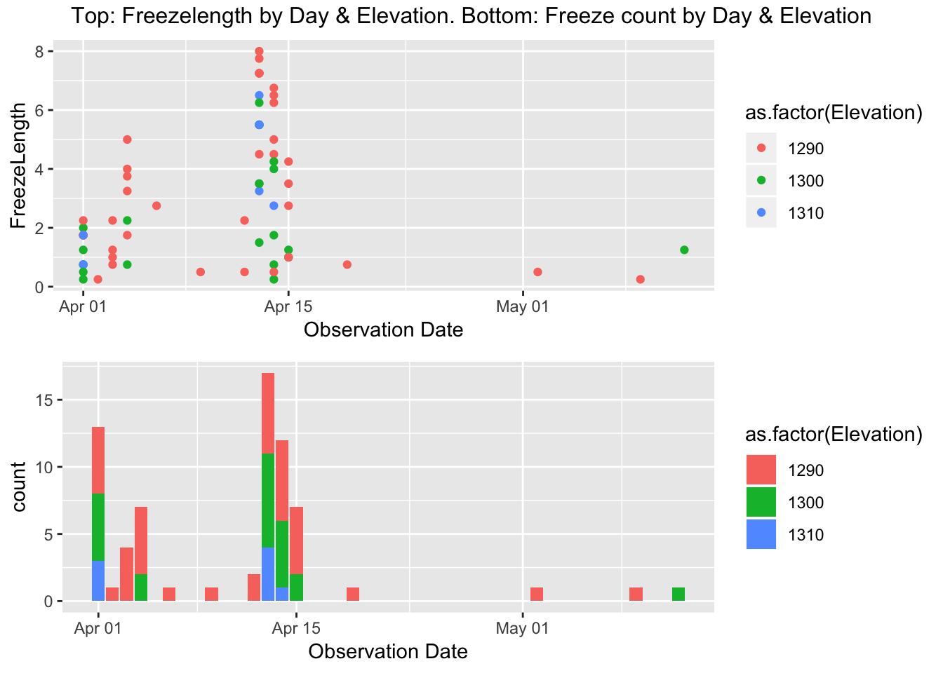 There are some notable characteristics here. First of all, we see more points for the lowest binned elevation, but we note that there is a larger variance for that group as well. Also, it turns out that the majority of our spring freeze after budbreak occurs April 1st - April 15th, while some rouge freezes occur throughout the rest of April and into May, but are of lower duration.
p3 <- dfsummary%>% filter(MinTemp < 0) %>% inner_join(dfloc, by = "ProbeNum")%>% ggplot(aes(x = as.factor(Elevationbin), y = MinTemp)) + geom_boxplot() + xlab("")

p4 <- df %>% filter(TempinC < 0) %>% group_by(ProbeNum,ObsTime) %>% summarize(FreezeStart = min(DateTime), FreezeEnd = max(DateTime),mintemp = min(TempinC)) %>% mutate(FreezeLength = as.numeric(difftime(FreezeEnd, FreezeStart, units = "hours"), units = "hours") + .25) %>% inner_join(dfloc, by = "ProbeNum") %>% mutate(Elevation = round(Elevation,-1)) %>% ggplot(aes(x = as.factor(Elevation), y = FreezeLength)) + geom_boxplot()+ xlab("Elevation (Rounded)") + ylab("Freeze Duration")


grid.arrange(p3,p4)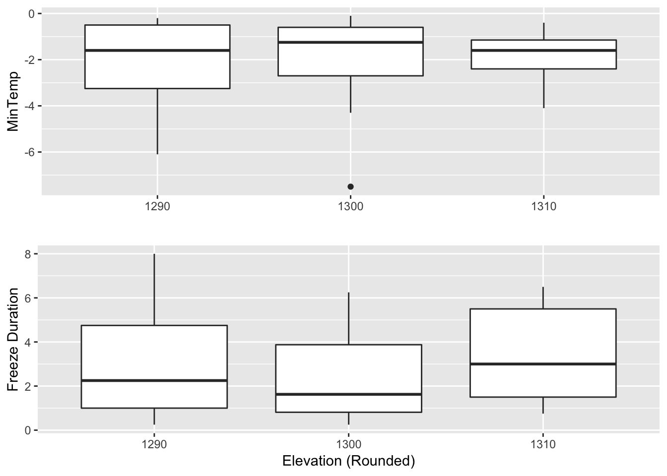
Lastly, while we see that the median of the duration of lower elevation freezes isn’t significantly more for higher elevations, but it does contain some longer durations. Additionally, the freezes drop down to lower temperatures compared to the other binned elevations.
Wrap-Up
We’ve managed to show a correlation between the occurences of freezes and lower elevation regions in our orchards. Furthermore, we showed that these lower elevation freezes have longer durations, and lower temperatures, which could be a potential risk for a debilitating spring freeze.
You can find an archive of the raw data here.