Simple and Multiple Linear Regression Models - Inference, Simpson's Paradox, Parallel Slopes, etc.
Introduction
I have recently taken a few courses on linear regression models. Linear regression was developed statistically, but is frequently used in machine learning. In fact, I wrote an article about GLMs, and their applications with spam filtering. Perhaps the easiest to understand algorithm in machine learning, you can also gain some insight about the data you’re modeling based on the coefficients of the linear model produced.
There’s a ton to dive into, so I’ll try to be as comprehensive as possible at a high level. A few of the topics we’ll be discussing are:
- Some background, and it’s mathematical form.
- Assessing the model, (simulation based inference, and confidence intervals for slope parameters)
- Simpson’s paradox, including non-ordinal variables in linear regression models, parallel slope models and interaction terms.
- multiple linear regression models, and parallel plane models.
- \(R^{2}\) Adjusted \(R^{2}\).
Background
In simple linear regression models, you try to predict the target variable by utilizing it’s relationship with an explanatory variable. Let variable \(Y\) be your target variable i.e. \(Y = f(X)\) and \(X\) your explanatory variable. When you employ linear regression in your model, you’re making an assumption that the relationship between these two variables can be described by a linear relationship
\[ Y \approx \beta_{0} + \beta_{1}X \]
Now, this is almost always an approximate linear relationship. The coefficients \(\beta_{0}\) and \(\beta_{1}\) are unknown and often noted as the intercept and slope parameter respectively. The mathematical formulation and derivation of each parameter is outside the scope of this article, but it should suffice to note that both of the coefficients which minimize errors involve the Pearson sample correlation coefficient:
\[ r_{xy} = \frac{ \sum_{i=1}^{n} (x_{i} - \bar{x}) (y_{i} - \bar{y})}{\sqrt{\sum_{i=1}^{n}(x_{i} - \bar{x})^2 \sum_{i=1}^{n}(y_{i} - \bar{y})^2} }\] The relationship between \(\beta_{0}\), \(\beta_{1}\) & \(r_{xy}\) is:
\[ \beta_{1} = r_{xy} \frac{s_{y}}{s_{x}} \\ \beta_{0} = \bar{y} - \beta_{1}\bar{x} \] Let’s look at a quick example where we declare a random array of numbers \(x\) and \(y\), where \(y = 2.9*x + \epsilon\). We then run a quick linear model, and look at \(\beta_{1}\) (it’s the estimate of x).
x <- rnorm(20, mean = 3, sd = 1)
y <- 5 +2.9 * x + runif(20)
##Linear Model
data.frame(x = x, y = y) %>% lm(y~x, data = .) %>% tidy()
## # A tibble: 2 x 5
## term estimate std.error statistic p.value
## <chr> <dbl> <dbl> <dbl> <dbl>
## 1 (Intercept) 5.34 0.211 25.4 1.53e-15
## 2 x 2.97 0.0621 47.8 2.05e-20calculating the coefficient \(\beta_{1}\) (semi) manually, using the pearson correlation coefficient & standard deviation of \(x\) and \(y\).
b1 <- cor(x,y) * sd(y)/sd(x)
b1
## [1] 2.966444Now \(\beta_{0}\)
mean(y) - b1*mean(x)## [1] 5.343254Sec 1.) Constructing a Linear Regression Model
Let’s perform simple linear regression on the dataset we’ll be using in the rest of this article. This dataset describes UN votes, for differing resolution of various countries throughout time. Our interest lies in the proportion of yes/no votes, and the their trend throughout time. Let’s go ahead and take a quick peak.
head(votes_perc_country, 6)## # A tibble: 6 x 6
## # Groups: year, continent [1]
## year continent countryname percent_yes total totalyes
## <dbl> <chr> <chr> <dbl> <int> <int>
## 1 1947 Africa Algeria 0 38 0
## 2 1947 Africa Angola 0 38 0
## 3 1947 Africa Benin 0 38 0
## 4 1947 Africa Botswana 0 38 0
## 5 1947 Africa Burkina Faso 0 38 0
## 6 1947 Africa Burundi 0 38 0let’s run a linear regression model that describes percentage of yes votes by the United States on UN resolutions as a function of time (years). First let’s get a scatterplot of percent_yes vs time.
votes_perc_country %>%filter(countryname == "United States") %>% ggplot(aes(x = year, y = percent_yes)) + geom_point() 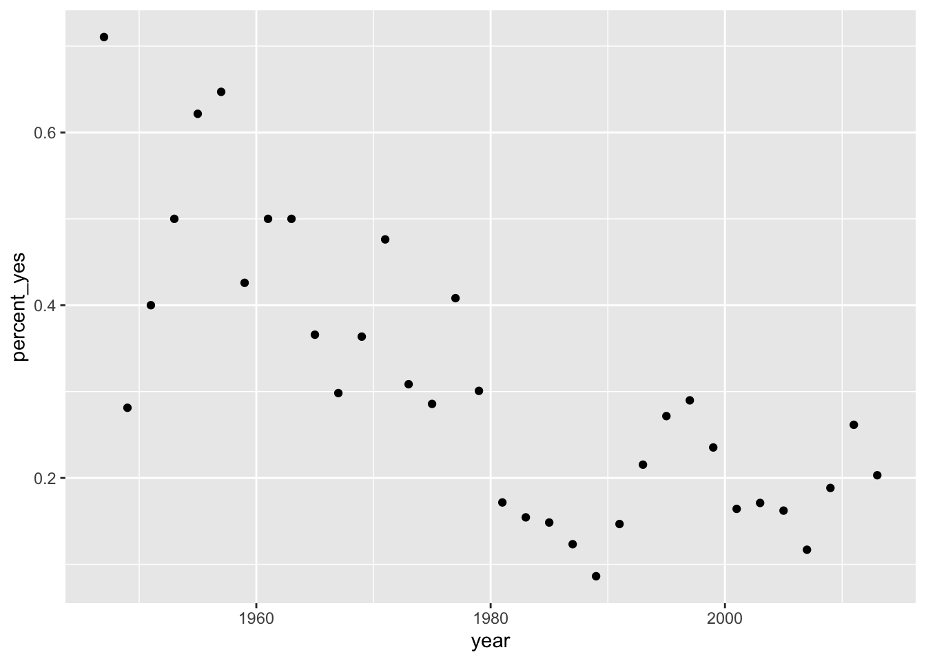
We can run a linear model by calling the function lm(), with the function being a simple linear one. \(percent \ yes \approx \beta_{0} + \beta_{1} Year\)
votes_perc_country %>%filter(countryname == "United States") %>% lm(percent_yes ~ year, data = .) %>% tidy() ## # A tibble: 2 x 5
## term estimate std.error statistic p.value
## <chr> <dbl> <dbl> <dbl> <dbl>
## 1 (Intercept) 12.7 1.84 6.87 0.0000000897
## 2 year -0.00624 0.000930 -6.70 0.000000144Let’s go ahead and look at the scatter plot again, with the overlay of our linear model.
votes_perc_country %>%filter(countryname == "United States") %>% ggplot(aes(x = year, y = percent_yes)) + geom_point() + geom_abline(slope = ab1$estimate[2], intercept = ab1$estimate[1], color = "red")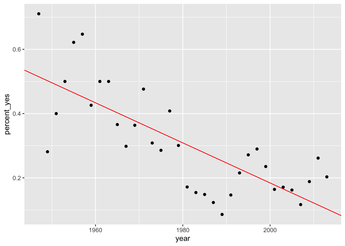
It’s apparent that a linear relationship exists between the variable Year and Percent_Yes. How could we test this data to be sure this linear relationship isn’t due purely to chance?
Permutation Tests (Simulation-Based Inference)
Permutation Tests allow us to distinguish the probability that the relationship between two parameters is due purely to chance. Testing the relationship between percentage of yes votes and year for the United States wouldn’t be the best example. Therefore, we’ll go ahead and look at the relationship between Saudi Arabia and the United States for the percentage of yes votes in UN resolutions each year.
transdf <- votes_perc_country[,-c(2,5,6)] %>% filter(countryname == "United States" | countryname == "Saudi Arabia") %>% spread(key = countryname, value = percent_yes)

ab2 <- transdf %>% lm(`United States` ~ `Saudi Arabia`, data = .) %>% tidy()

transdf %>% ggplot(aes(x = `Saudi Arabia`, y = `United States`)) + geom_point() +  geom_abline(slope = ab2$estimate[2], intercept = ab2$estimate[1], color = "red")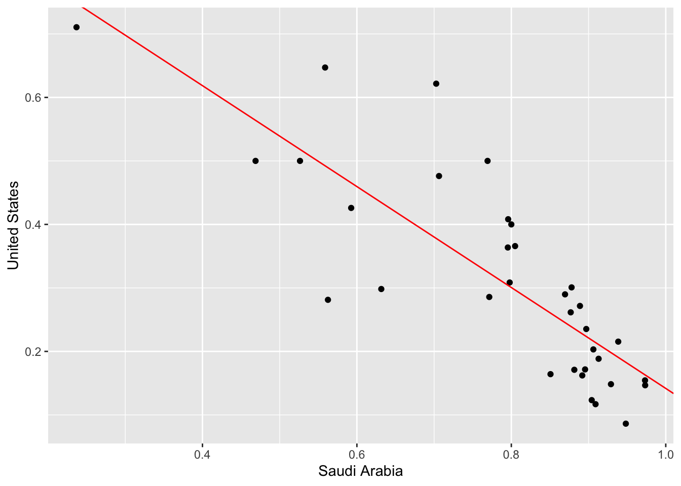
We see that there is a negative linear relationship. What does that mean? Well, for each UN session (which is yearly) the United States tends to vote yes at a higher rate when Saudi Arabia votes yes at a lower rate. What are the odds that this linear relationship is due purely to randomness? We can perform a permutation test, also known as simulation-based inference that addresses this exact question.
Permutation tests work by essentially shuffling the columns at random, and obtaining the slope parameters by running linear regression models on the permuted data. Below I illustrate an example table, and below a permuted table. The columns of interest are Saudi Arabia, and United States.
| year | Saudi Arabia | United States |
|---|---|---|
| 1947 | 0.2368421 | 0.7105263 |
| 1949 | 0.5625000 | 0.2812500 |
| 1951 | 0.8000000 | 0.4000000 |
| 1953 | 0.7692308 | 0.5000000 |
| 1955 | 0.7027027 | 0.6216216 |
| 1957 | 0.5588235 | 0.6470588 |
| year | Saudi Arabia | United States |
|---|---|---|
| 1947 | 0.8000000 | 0.7105263 |
| 1949 | 0.7027027 | 0.2812500 |
| 1951 | 0.5625000 | 0.4000000 |
| 1953 | 0.5588235 | 0.5000000 |
| 1955 | 0.2368421 | 0.6216216 |
| 1957 | 0.7692308 | 0.6470588 |
Once the linear regression models are obtained, the probability density can be plotted. It’s worth noting that we usually expect the distribution to straddle \(\beta_{1} = 0\) and is almost always relatively normal. The reason why we expect this, is because when an individual column is permuted the relationship is negated and we can expect the linear model to have a slope coefficient that is relatively low. Below, I have taken the full length of the first table (which is 34 rows). I have permuted the rows 1000 times and obtained the slope coefficient for each permutation. Then I plotted the density function, as well as our true slope coefficient (denoted by a red vertical line). You can tell, that the slope coefficient lies well outside the distribution of the permuted slopes. Which implies that it would be highly unlikely to obtain a dataset with the relationship we observed from a population with no relationship.
transdf %>% specify(`United States` ~ `Saudi Arabia`) %>% hypothesize(null = "independence") %>% generate(reps = 1000, type = "permute") %>% calculate(stat = "slope") %>% ggplot(aes(x = stat)) + geom_density() + geom_vline(xintercept = ab2$estimate[2], color = "red") + xlim(-1,1)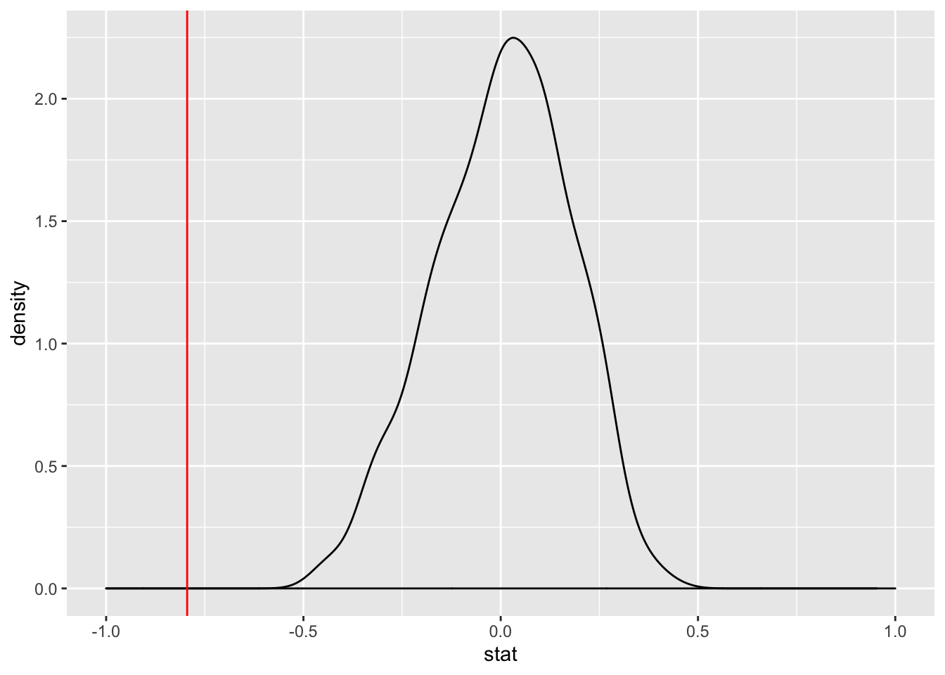
As we can see, this is confirmed in the output of the linear model we ran. The P-value for our slope indicates that it would be extremely unlikely that we would find this relationship between Saudi Arabia and United State’s votes percentage due purely to chance.
ab2## # A tibble: 2 x 5
## term estimate std.error statistic p.value
## <chr> <dbl> <dbl> <dbl> <dbl>
## 1 (Intercept) 0.936 0.0789 11.9 2.91e-13
## 2 `Saudi Arabia` -0.795 0.0978 -8.13 2.78e- 9Sec. 2) Confidence Interval
Now that we know that a relationship exists, we’re interested in obtaining the confidence interval of our slope parameter. There are multiple ways of obtaining values for confidence intervals. We could use the standard error of the model output, and then calculate the t score for a 95% CI. We could also use bootstrap sampling, to simulate a distribution for \(\beta_{1}\). Both of these methods should give us very similar bounds for our confidence interval.
Let’s go ahead and begin with the first. Our model has already been tidied into a dataframe.
ab2 ## # A tibble: 2 x 5
## term estimate std.error statistic p.value
## <chr> <dbl> <dbl> <dbl> <dbl>
## 1 (Intercept) 0.936 0.0789 11.9 2.91e-13
## 2 `Saudi Arabia` -0.795 0.0978 -8.13 2.78e- 9## Extracting our degrees of freedom
dof <- nrow(transdf) - 2
## definine our confidence interval
alpha <- 0.05
confint <- 1.0 - alpha
Pupper <- 1.0 - alpha/2.0
criticalval <- qt(Pupper, dof)
### Recall our model
ab2 <- transdf %>% lm(`United States` ~ `Saudi Arabia`, data = .) %>% tidy(conf.int = TRUE, conf.level = confint)
ab2 %>% mutate(lower = estimate - criticalval*std.error, upper = estimate + criticalval*std.error) %>% dplyr::select(term, estimate, std.error, lower, upper)## # A tibble: 2 x 5
## term estimate std.error lower upper
## <chr> <dbl> <dbl> <dbl> <dbl>
## 1 (Intercept) 0.936 0.0789 0.776 1.10
## 2 `Saudi Arabia` -0.795 0.0978 -0.994 -0.596Simulation based CI by bootstrapping, with replacement.
set.seed(123)
slope_sim <- transdf[,2:3] %>% specify(`United States` ~ `Saudi Arabia`) %>% generate(reps = 100, type = "bootstrap") %>% calculate(stat = "slope")
slope_sim %>% summarize(lower = mean(stat) - 2*sd(stat), upper = mean(stat) + 2*sd(stat))
## # A tibble: 1 x 2
## lower upper
## <dbl> <dbl>
## 1 -1.01 -0.585We can visualize this to obtain an illustrative plot of all the model parameters we obtained on the 100 iterations of the bootstrap samples.
cibootplot <- transdf %>% ggplot(aes(x = `Saudi Arabia`, y = `United States`)) + geom_point()

bootmodels <- transdf[,2:3] %>% specify(`United States` ~ `Saudi Arabia`) %>% generate(reps = 100, type = "bootstrap") %>% group_by(replicate) %>% do(lm(`United States` ~ `Saudi Arabia`, data = .) %>% tidy()) %>% .[,1:3] %>% spread(key = term, value = estimate) %>% rename(inter = `(Intercept)`, slope = `\`Saudi Arabia\`` ) %>% as.data.frame()

for (i in 1:nrow(bootmodels)){
cibootplot <- cibootplot + geom_abline(slope = bootmodels[i,3], intercept = bootmodels[i,2], color = "blue")
}

cibootplot +  geom_abline(slope = ab2$estimate[2], intercept = ab2$estimate[1], color = "red")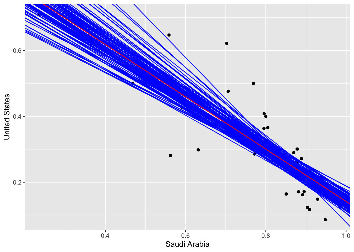
Sec 2.) Simpsons Paradox, Non-ordinal variables, and parallel slopes models.
Simpson’s paradox is a circumstance where a correlation or dependency disappears or reverses when multiple groups are combined. Let’s take a frequently utilized dataset, the mpg dataset. It contains the mpg of various automobiles, the engine displacement, and cylinder count, as well as other variables. For this example, we’ll just observe the previously mentioned variables. Here is a simple linear regression on mpg vs displacement, without accounting for cylinder count.
data(mpg)
mpg <- mpg %>% filter(cyl != 5 )
mpg  %>% do(lm(hwy ~ displ, data = .) %>% tidy()) %>% dplyr::select( term, estimate) %>% spread(value = estimate, key = term) %>% as.data.frame()
## (Intercept) displ
## 1 35.59766 -3.511293mpg %>% ggplot(aes(x = displ, y = hwy)) + geom_point() + geom_smooth(method = "lm", se = F, color = "black")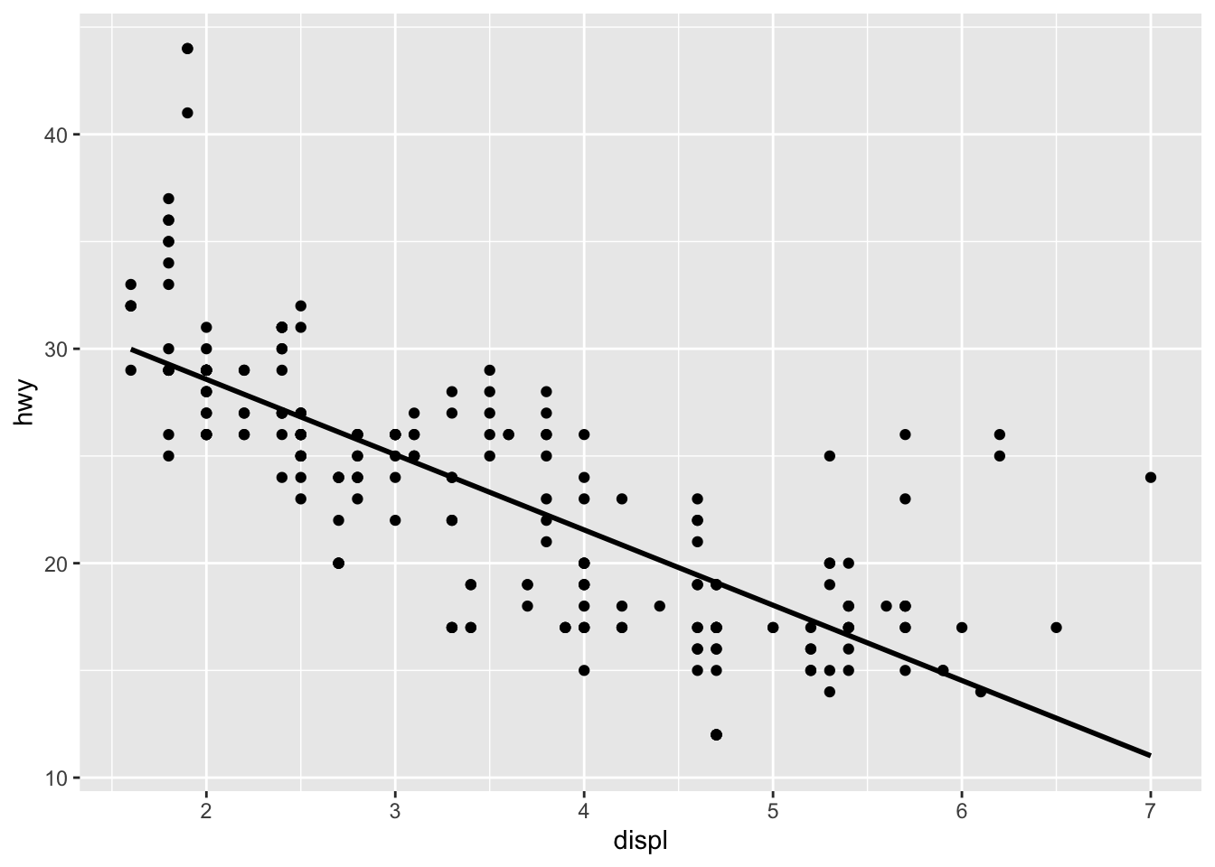
This model tells us that for every unit of engine displacement, a car’s mpg is decreased by 3.5 miles per gallon. It’s worth noting that this does not account for the number of cylinders contained in each car’s engine. When the cylinder count is considered, we see a perfect example of Simpson’s paradox.
mpg_mods<- mpg %>% group_by(cyl) %>% do(lm(hwy ~ displ, data = .) %>% tidy()) %>% dplyr::select(cyl, term, estimate) %>% spread(value = estimate, key = term) %>% as.data.frame()
mpg_mods
## cyl (Intercept) displ
## 1 4 46.60051 -8.294829
## 2 6 36.37976 -3.976981
## 3 8 10.97439 1.296390mpgplot <- mpg %>% ggplot(aes(x = displ, y = hwy, color = as.factor(cyl))) + geom_point() + geom_abline(slope = mpg_mods[1,3], intercept = mpg_mods[1,2], color = "red")+ geom_abline(slope = mpg_mods[2,3], intercept = mpg_mods[2,2], color = "green") + geom_abline(slope = mpg_mods[3,3], intercept = mpg_mods[3,2], color = "blue")
mpgplot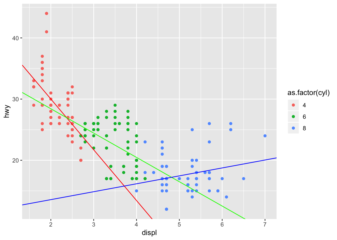
Not only does the change in mpg per unit of displacement change, but we see that for 8 cylinder vehicles, the change is actually positive! This is what the definition of Simpson’s paradox is. In each cylinder group, the change in mpg per unit displacement is substantially different. When we combine all of the groups into one dataset, we essentially negate positive change in mpg per unit displacement of the 8 cylinder group as well as the large negative change in mpg of the 4 cylinder group.
Parallel Slopes Model (Introducing non-ordinal variables)
In the example above, our cylinder count was ordinal (it has some measure of quantitative order). What if our groups were non-ordinal though? There’s several ways to approach the inclusion of categorical variables in a linear model. Let’s take a look at the mpg dataset again, and plot the mpg vs displacement among different fuel types. Here, we’ll only take regular and premium into account since they’re the two largest groups.
mpg %>% filter(fl == "r" | fl == "p") %>% ggplot(aes(x = displ, y = hwy, color = fl)) + geom_point()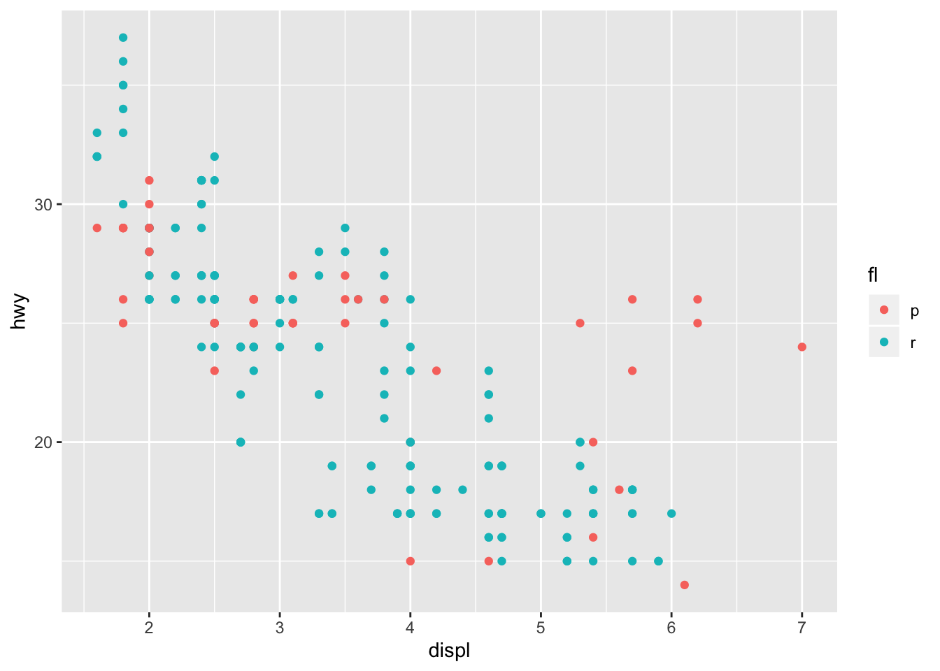
We can introduce the fuel type (fl) as a categorical variable in our model. Therefore, the linear formula of the model will take the form:
\[ hwy_{mpg} \approx \beta_{0} + \beta_{1}displ + \beta_{2}fl \] It’s worth noting that for binary variables, (variables that can only take two values) lm() will encode one value as one, and the other as zero. Therefore, when fuel is equal to p, it will equal one. When that occurs, then \(\beta_{3}\) and \(\beta_{1}\) sum to change the y intercept, while maintaining the same slope. hence parallel slope mode
All we have to do, is indicate that we wish to model a formula of that form in lm()
mpg_mod_pll <- mpg %>% filter(fl == "r" | fl == "p") %>% lm(hwy ~ displ + as.factor(fl), data = .)

mpg_mod_pll %>% summary()
##
## Call:
## lm(formula = hwy ~ displ + as.factor(fl), data = .)
##
## Residuals:
## Min 1Q Median 3Q Max
## -7.9190 -2.1696 -0.1963 1.7472 10.4969
##
## Coefficients:
## Estimate Std. Error t value Pr(>|t|)
## (Intercept) 35.4736 0.7301 48.59 < 2e-16 ***
## displ -3.1386 0.1753 -17.91 < 2e-16 ***
## as.factor(fl)r -1.5524 0.5228 -2.97 0.00332 **
## ---
## Signif. codes: 0 '***' 0.001 '**' 0.01 '*' 0.05 '.' 0.1 ' ' 1
##
## Residual standard error: 3.272 on 213 degrees of freedom
## Multiple R-squared: 0.6159, Adjusted R-squared: 0.6123
## F-statistic: 170.8 on 2 and 213 DF, p-value: < 2.2e-16Let’s go ahead and visualize the model:
mpg_pll_params <- mpg_mod_pll %>% tidy() %>% as.data.frame()
mpg %>% filter(fl == "r" | fl == "p") %>% ggplot(aes(x = displ, y = hwy, color = fl)) + geom_point() + geom_abline(intercept = mpg_pll_params[1,2], slope = mpg_pll_params[2,2], color = "red") + geom_abline(intercept = mpg_pll_params[1,2] + mpg_pll_params[3,2], slope = mpg_pll_params[2,2], color = "darkturquoise")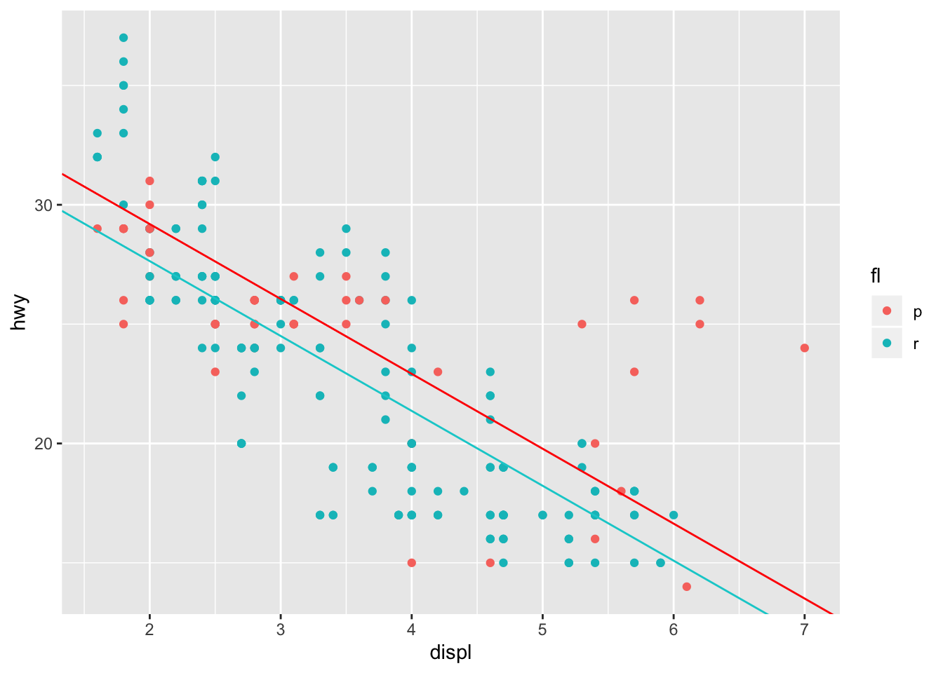
This tells us, that the expected MPG for an automobile with regular gasoline is roughly 1.5 mpg lower than an automobile that utilizes premium gasoline with the same engine displacement.
Interaction term
The large residuals that appear in the premium group for large engine displacement indicates that an interaction term in the model might lead to a better fit. Introducing this interaction term subsequently leads to our model taking the form:
\[ hwy_{mpg} \approx \beta_{0} + \beta_{1}displ + \beta_{2}fl + \beta_{3}displ \cdot fl \] As I mentioned previously, the binary variable fl will only take the values of 0 or 1 in our linear model. Therefore, when fl = r our model will take the form:
\[ hwy_{mpg} \approx \beta_{0} + \beta_{1}displ + \beta_{3} + \beta_{4}displ \approx (\beta_{0} + \beta_{2}) + (\beta_{1} + \beta_{3}) \cdot displ \]
mpg_r_p <- mpg %>% filter(fl == "r" | fl == "p")
mpg_int_params <- lm(hwy ~ displ + as.factor(fl) + as.factor(fl): displ, data = mpg_r_p)

plotModel(mpg_int_params, system = "ggplot2")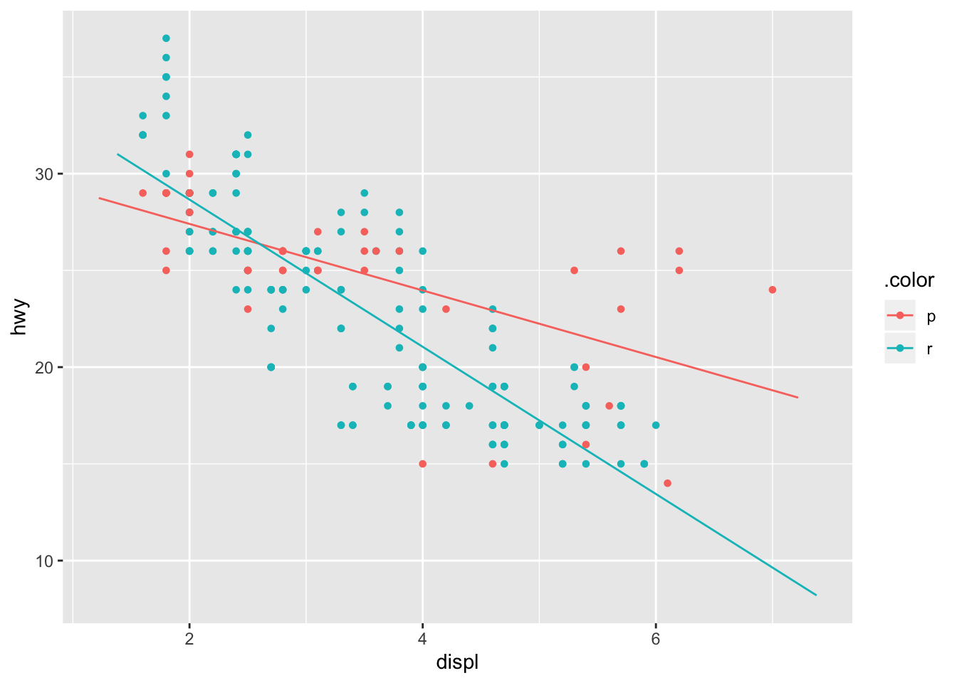
This is further illustrated by the evaluated coefficients that can by obtained in the summary of the model. as.factor(fl)r illustrates that the coefficient \(\beta_{2}\) will take the value 5.4231 when fl = r.
mpg_int_params %>% summary()##
## Call:
## lm(formula = hwy ~ displ + as.factor(fl) + as.factor(fl):displ,
## data = mpg_r_p)
##
## Residuals:
## Min 1Q Median 3Q Max
## -8.9638 -1.7689 0.0583 1.8188 7.5797
##
## Coefficients:
## Estimate Std. Error t value Pr(>|t|)
## (Intercept) 30.8446 1.0285 29.991 < 2e-16 ***
## displ -1.7202 0.2876 -5.982 9.27e-09 ***
## as.factor(fl)r 5.4231 1.2634 4.292 2.69e-05 ***
## displ:as.factor(fl)r -2.0839 0.3486 -5.978 9.44e-09 ***
## ---
## Signif. codes: 0 '***' 0.001 '**' 0.01 '*' 0.05 '.' 0.1 ' ' 1
##
## Residual standard error: 3.034 on 212 degrees of freedom
## Multiple R-squared: 0.6713, Adjusted R-squared: 0.6667
## F-statistic: 144.3 on 3 and 212 DF, p-value: < 2.2e-16Multiple Linear Regression, and Parallel Planes
The previous parallel plane model was technically a multiple linear regression mode, although I decided to categorize it as an extension of a simple linear regression model. The type of multiple linear regression models contained here possess more than one numerical explanatory variable. It’s extension the parallel planes model is similar to the parallel slope model, in that it includes a non-ordinal (or categorical) variable in the model.
In this section we’ll be using the Cars93 dataset from MASS, this dataset contains roughly 100 observations of mechanical characteristics and price ranges of vehicles in 1993. For our first multiple regression model, we’ll try and vehicle price as a function of it’s weight and horsepower. First, let’s visualize the space. Since there are two numerical explanatory variables, and one numerical target variable, our visualization is much more constructive in a 3 - dimensional space. For this, we have to use the plot_ly function from the plotly package. Note that the price is in thousands of USD.
carsplot <- plot_ly(data = Cars93, x = ~Weight, y = ~Horsepower, z = ~Price, opacity = 0.9) %>% add_markers()
carsplot
## Warning: Factor `.plotlyGroupIndex` contains implicit NA, consider using
## `forcats::fct_explicit_na`
## Warning: Factor `.plotlyGroupIndex` contains implicit NA, consider using
## `forcats::fct_explicit_na`We see that there is a correlation between the price and horsepower of vehicles in this dataset, as well as price and weight. This is probably due to SUVs and trucks retailing higher than small sedans during this period. To obtain a multiple linear regression model, we turn to the lm() function yet again, and describe the model we’d like to fit as:
\[ Price \approx \beta_{0} + \beta{1} \cdot Weight + \beta{2} \cdot Horsepower \]
carsmod <- lm( Price ~ Weight + Horsepower, data = Cars93)
carsmodparams <-carsmod %>% tidy()
carsmod %>% summary()
##
## Call:
## lm(formula = Price ~ Weight + Horsepower, data = Cars93)
##
## Residuals:
## Min 1Q Median 3Q Max
## -15.086 -2.986 -0.469 1.592 32.120
##
## Coefficients:
## Estimate Std. Error t value Pr(>|t|)
## (Intercept) -5.784940 3.434741 -1.684 0.0956 .
## Weight 0.002338 0.001557 1.502 0.1367
## Horsepower 0.125917 0.017534 7.181 1.91e-10 ***
## ---
## Signif. codes: 0 '***' 0.001 '**' 0.01 '*' 0.05 '.' 0.1 ' ' 1
##
## Residual standard error: 5.936 on 90 degrees of freedom
## Multiple R-squared: 0.6305, Adjusted R-squared: 0.6223
## F-statistic: 76.8 on 2 and 90 DF, p-value: < 2.2e-16The summary of our model indicates that the coefficient for Horsepower is much larger than the coefficient for Weight. Does this mean that price increases considerably more depending on horsepower? Well yes, but you should be careful when making these inferences. First, you have to be conscious of the units of these coefficients. In our data the difference between the highest and lowest Horsepower is roughly 250 Horsepower. While the difference in Weight is roughly 2500 lbs. That’s an entire order of magnitude.
Before we start visualizing our model in 3d space, we should look at a 2d representation of our model over-layed on the scatterplot of our data.
grid <-  expand.grid(Weight = seq(min(Cars93$Weight), max(Cars93$Weight), length.out = 100), Horsepower = seq(min(Cars93$Horsepower), max(Cars93$Horsepower), length = 100))
fits <- broom::augment(carsmod, newdata = grid)
p1 <- Cars93 %>% ggplot(aes(x = Weight, y = Horsepower)) + geom_point(aes(color = Price))
p1 + geom_tile(data = fits, aes(fill = .fitted), alpha = 0.8) + scale_fill_distiller() + geom_hline(yintercept = 100, color = "red") + geom_vline( xintercept = 3000, color = "green") 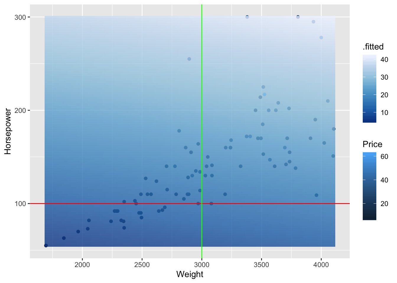
The fit of our model is represented by the opaque plane and by the legend .fitted. We see two lines overlayed with constant Horsepower and Weight Values. For the line with constant Horsepower (red) we see that the fitted values do not change much as we move along the weights. This is equivalent to saying there is little change in price with respect to weight, as we hold horsepower constant. The converse is true as we change horsepower by holding weight constant (green). We see that the gradient gets lighter which our model describes as a higher fitted price.
This is further illustrated in the 3 dimensional plot below:
Weights <- seq(min(Cars93$Weight), max(Cars93$Weight), length = 50)
Horsepowers <- seq(min(Cars93$Horsepower),max(Cars93$Horsepower), length = 50)
fits <- outer(Weights, Horsepowers, function(x1,x2){-5.784940 + 0.002338*x1 + 0.125917*x2})
fits <- t(fits)

carsplot %>% add_surface(x = ~Weights , y = ~Horsepowers, z= ~fits )
Parallel Planes Model
The parallel planes model, which is an extension of the parallel lines model incorporates a categorical (non-ordinal) variable into our multiple linear regression model. Here we incorporate the origin of the automobile, and categorize domestic and foreign vehicles. First, let’s visualize our 3-dimensional space, and color code the categories.
carsoriginplot <-plot_ly(data = Cars93, x = ~Weight, y = ~Horsepower, z = ~Price, opacity = 0.9) %>%  add_markers(color = ~ Origin)
carsoriginplot
We see that the automobiles in the foreign group tend to become a little more expensive, and that divergence is more apparent in the most expensive region of the space (also higher HP). Let’s go ahead and run a parallel plane model, whos parameters might shed more light on this relationship.
Our formula will take the form:
\[ Price \approx \beta_{0} + \beta_{1}\cdot Weight + \beta_{2} \cdot Horsepower + \beta_{3} \cdot Origin \ \ \ \ \ \ Origin = \{1,0\} \] Where origin = 0 if the automobile is domestic.
carsppmod <- Cars93 %>% lm(Price ~ Weight + Horsepower + Origin, data = .)
carsppmod %>% summary()
##
## Call:
## lm(formula = Price ~ Weight + Horsepower + Origin, data = .)
##
## Residuals:
## Min 1Q Median 3Q Max
## -13.0542 -3.1723 -0.7369 2.3275 30.1841
##
## Coefficients:
## Estimate Std. Error t value Pr(>|t|)
## (Intercept) -10.075080 3.572653 -2.820 0.00592 **
## Weight 0.003464 0.001534 2.258 0.02637 *
## Horsepower 0.119158 0.016918 7.043 3.8e-10 ***
## Originnon-USA 3.721790 1.217061 3.058 0.00294 **
## ---
## Signif. codes: 0 '***' 0.001 '**' 0.01 '*' 0.05 '.' 0.1 ' ' 1
##
## Residual standard error: 5.679 on 89 degrees of freedom
## Multiple R-squared: 0.6657, Adjusted R-squared: 0.6544
## F-statistic: 59.07 on 3 and 89 DF, p-value: < 2.2e-16Our adjusted \(R^{2}\) has improved, and we see that vehicles with the same weight and horsepower are on average $3.7k more expensive than their similar domestic counterparts.
This is better illustrated with a parallel plane visualization:
planeForeign <- outer(Weights, Horsepowers, function(a,b){-10.075 + 0.003*a + 0.119*b + 3.72})
planeDomestic <- outer(Weights, Horsepowers, function(a,b){-10.075 + 0.003*a + 0.119*b})
planeDomestic <- t(planeDomestic)
planeForeign <- t(planeForeign)
carsoriginplot %>% add_surface(x = ~Weights, y = ~Horsepowers, z = ~planeForeign, showscale = FALSE) %>% add_surface(x = ~Weights, y = ~Horsepowers, z = ~planeDomestic, showscale = FALSE)
R^2, Adjusted R^2.
Great, you’ve managed to learn how to perform linear regression, and multiple linear regression on datasets. How can you assess their performance though?
One good sign is the value of \(R^{2}\) in your model summary, and it involves the residuals of the model (difference between the observed and fitted values of your model), and the total sum of squares. The definitions are below:
\[ R^{2} = 1 - \frac{SS_{res}}{SS_{tot}} \\ SS_{res} = \sum_{i} (y_{i} - \hat{y}_i)^2\\ SS_{tot} = \sum_{i} (y_{i} - \bar{y}_i)^2 \]
Let’s our first linear model, where we fit the percentage of yes votes as a function of the year.
votes_perc_country %>%filter(countryname == "United States") %>% lm(percent_yes ~ year, data = .) %>% summary()##
## Call:
## lm(formula = percent_yes ~ year, data = .)
##
## Residuals:
## Min 1Q Median 3Q Max
## -0.22100 -0.08093 -0.01313 0.07854 0.19581
##
## Coefficients:
## Estimate Std. Error t value Pr(>|t|)
## (Intercept) 12.6563364 1.8422209 6.870 8.97e-08 ***
## year -0.0062361 0.0009304 -6.703 1.44e-07 ***
## ---
## Signif. codes: 0 '***' 0.001 '**' 0.01 '*' 0.05 '.' 0.1 ' ' 1
##
## Residual standard error: 0.1064 on 32 degrees of freedom
## Multiple R-squared: 0.584, Adjusted R-squared: 0.571
## F-statistic: 44.93 on 1 and 32 DF, p-value: 1.443e-07Our value is 0.584. Let’s go ahead and confirm that. All model outputs with lm() contain the residuals of the fits.
votesmod <- votes_perc_country %>%filter(countryname == "United States") %>% lm(percent_yes ~ year, data = .)

mean_yes <- votes_perc_country %>%filter(countryname == "United States") %>% .$percent_yes %>% mean()

perc_yes <- votes_perc_country %>%filter(countryname == "United States") %>% .$percent_yes

SStot <- sum((perc_yes - mean_yes)^2)

SSres <- sum(votesmod$residuals^2)

1 - SSres/SStot
## [1] 0.5840231As you see, SStot is the total sum of squares, and is only characterized by the underlying dataset you’re attempting to model. It is completely independent of the performance of your regression model.
The Adjusted R squared is used when your model contains more than one explanatory variable, and is very similar to \(R^2\).
\[ R_{Adj} = 1 - (1-R^{2})[\frac{n-1}{n-k-1}]\]
Where n is the sample size and k is the number of explanatory variables utlized in your regression model.