Ham Or Spam GLM/Random Forest Classifiers & Model Evaluation
Introduction
Using machine learning classification to predict and filter out unsolicited spam emails isn’t a new topic. Building models to accomplish this task have been written about in Kaggle, Towards Data Science & R-bloggers before. Usually though, the dataset gets introduced, visualized, and a model is hastily constructed. Furthermore, very little clarification is given as to why the specific model type, or training parameters were selected.
In this article, I’ll attempt to be as clear and concise as possible. The main package we’ll be utilizing in this article is caret with both GLM & GLMNet models.GLM Stands for Generalized Linear Model, the type we’ll be utilizing is the GLM Logit model (otherwise known as logistic regression) which is a very popular method used to model binary classifications. In our case, we wish to model whether or not the incoming email is indeed spam and therefore transferred to a theoretical spam folder.
After bulding the model, we’ll cover ROC curves and the AUC, specificity and sensitivity, build some confusion matricies. We’ll conclude the article by summarizing the process of building our model, after comparing it with a random forest model.
A Primer about Logistic Regression
Logistic regression is very similar to regular linear regression type models. In a simple multiple linear regression model with n input variables, the response variable \(Y\) is modeled in terms of some linear combination of the product of input variables \(X_{i}\) with coefficients (usually denoted as \(\beta_{i}\)) The coefficients are found by some algorithm that minimizes the sum of squared residuals.
\[ Y \approx \beta_{0} + \beta_{1} X_{1} + \beta_{2}X_{2} + \beta_{3} X_{3} + ... + \beta_{n} X_{n} \]
For binary classification we attempt to model the probability that a set of input variables belongs to a dichotomous variable namely spam, in our example. We could go ahead and perform a multiple linear regression, but it would be illogical since the response could fall out of the interval \([0,1]\). Why does that matter? Well, there’s no such thing as a probability greater than one, and a negative probabilty is counter-intuitive as well.
Fortunately for us, the sigmoid function solves this problem, and allows us to model the response in the interval \([0,1]\). This can be done by utilizing a method called maximum likelihood.
\[ P(X) = \frac{e^{\beta_{0} + \beta_{1}X_1 + \beta_{2}X_2 + ..+ \beta_{n}X_n }}{ 1+e^{\beta_{0} + \beta_{1}X_1 + \beta_{2}X_2 + ..+ \beta_{n}X_n }} \]
Caret takes care of all of this for us, as well as applying the cross validation scheme. Sometimes, random sampling isn’t such a great idea especially if there’s a class imbalance in the response variable of your dataset. Fortunately, there are functions in caret, such as createFolds, that will address such an issue. For now, we’ll digress and move on to the next section.
Data & Exploratory Analysis
I first came across this data in a course titled “Machine Learning Toolbox” on DataCamp, and I thought it was very interesting. You can also find it on UCI’s machine learning repo. Here’s a link to it.
Let’s take the time to look at the structure of our data, and the input variables it contains.
str(email)## 'data.frame': 3921 obs. of 19 variables:
## $ spam : num 0 0 0 0 0 0 0 0 0 0 ...
## $ to_multiple : Factor w/ 2 levels "no","yes": 1 1 1 1 1 1 2 2 1 1 ...
## $ from : Factor w/ 2 levels "no","yes": 2 2 2 2 2 2 2 2 2 2 ...
## $ cc : Factor w/ 2 levels "no","yes": 1 1 1 1 1 1 1 2 1 1 ...
## $ sent_email : Factor w/ 2 levels "no","yes": 1 1 1 1 1 1 2 2 1 1 ...
## $ image : Factor w/ 2 levels "no","yes": 1 1 1 1 1 1 1 2 1 1 ...
## $ attach : Factor w/ 2 levels "no","yes": 1 1 1 1 1 1 1 2 1 1 ...
## $ dollar : Factor w/ 2 levels "no","yes": 1 1 2 1 1 1 1 1 1 1 ...
## $ winner : Factor w/ 2 levels "no","yes": 1 1 1 1 1 1 1 1 1 1 ...
## $ inherit : Factor w/ 2 levels "no","yes": 1 1 2 1 1 1 1 1 1 1 ...
## $ password : Factor w/ 2 levels "no","yes": 1 1 1 1 2 2 1 1 1 1 ...
## $ num_char : num 11.37 10.5 7.77 13.26 1.23 ...
## $ line_breaks : int 202 202 192 255 29 25 193 237 69 68 ...
## $ format : Factor w/ 2 levels "HTML","Plain": 1 1 1 1 2 2 1 1 2 1 ...
## $ re_subj : Factor w/ 2 levels "no","yes": 1 1 1 1 1 1 1 1 1 1 ...
## $ exclaim_subj: Factor w/ 2 levels "no","yes": 1 1 1 1 1 1 1 1 1 1 ...
## $ urgent_subj : Factor w/ 2 levels "no","yes": 1 1 1 1 1 1 1 1 1 1 ...
## $ exclaim_mess: num 0 1 6 48 1 1 1 18 1 0 ...
## $ number : Factor w/ 3 levels "none","small",..: 3 2 2 2 1 1 3 2 2 2 ...You can find more information on what each variable represents by following the UCI link posted above. Some of them are pretty self explanatory, and represent whether the variable is actually present in the email such as “winner”, “inherit”.. etc.
As you can see, we have 15 input variables with factor classes, 2 numerical and one integer. Let’s go ahead and visualize a boxplot of each numerical variable catagorized by spam/ham. Since some of these numbers are quite large, we have to logarithmically scale the variables. We also add 1 to exclaim_mess to avoid any errors thrown on observations where there are 0 exclamation points.
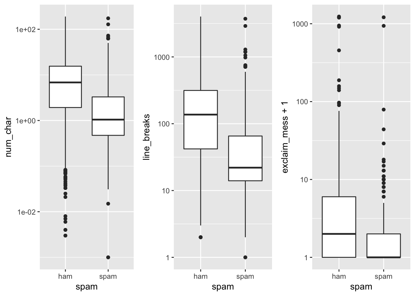
As we can tell, the distribution of the number of characters in a spam email is tends to be slightly lower, along with the line breaks and exclamation points contained in the email.
Let’s go ahead and visualize the catagorical variables, filled by the spam/ham catagory.
email %>% mutate(spam = as.factor(ifelse(spam ==1, "spam", "ham"))) %>% .[,sapply(.,class)== "factor"] %>% gather("var", "val", 2:16) %>% ggplot(aes(x = val, fill = spam)) + geom_bar(position = "fill") + facet_wrap(~var, scales = "free") 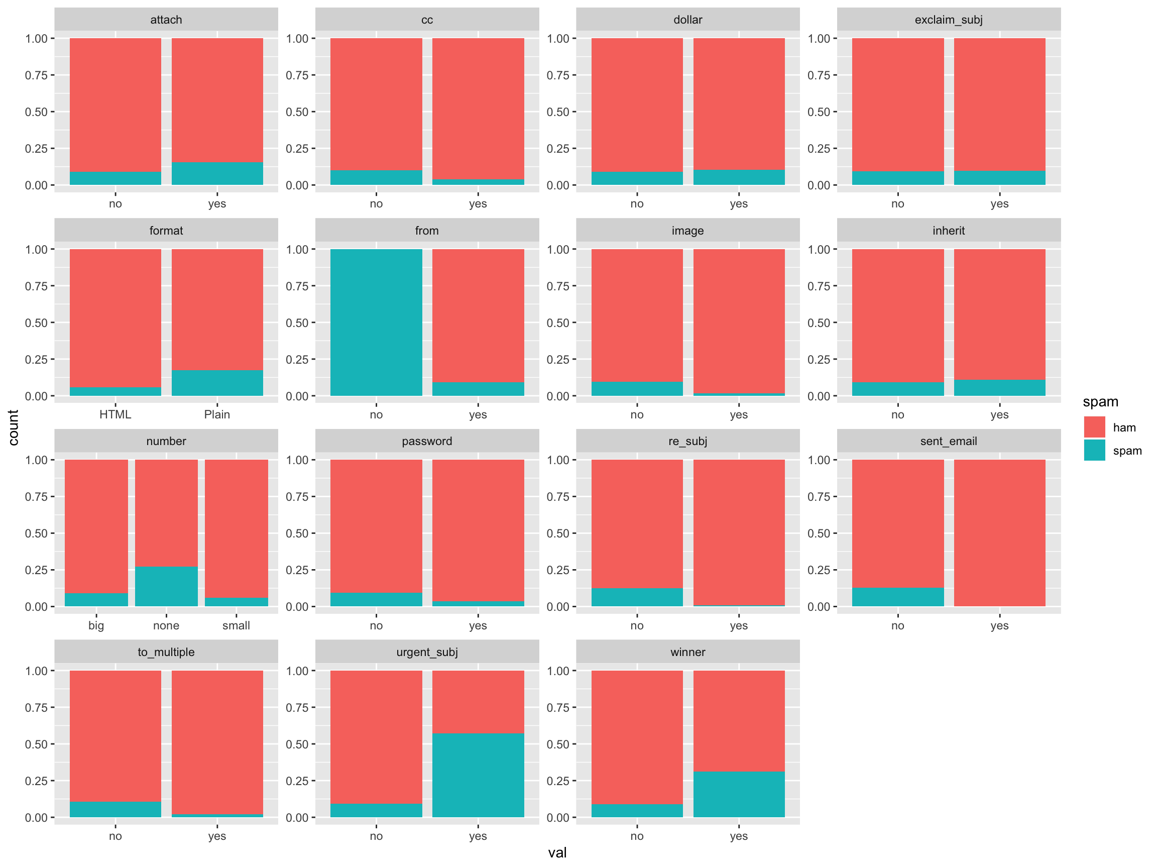
If we visualize the class makeup of our response variable, we see that there is a significant class imbalance. The spam/ham make up is about 10%/90%.
email %>% mutate(spam = as.factor(ifelse(spam ==1, "spam", "ham"))) %>% ggplot(aes(x = as.factor(""), fill = spam)) + geom_bar(position = "fill") + xlab("")+ ylab("Number of Observations")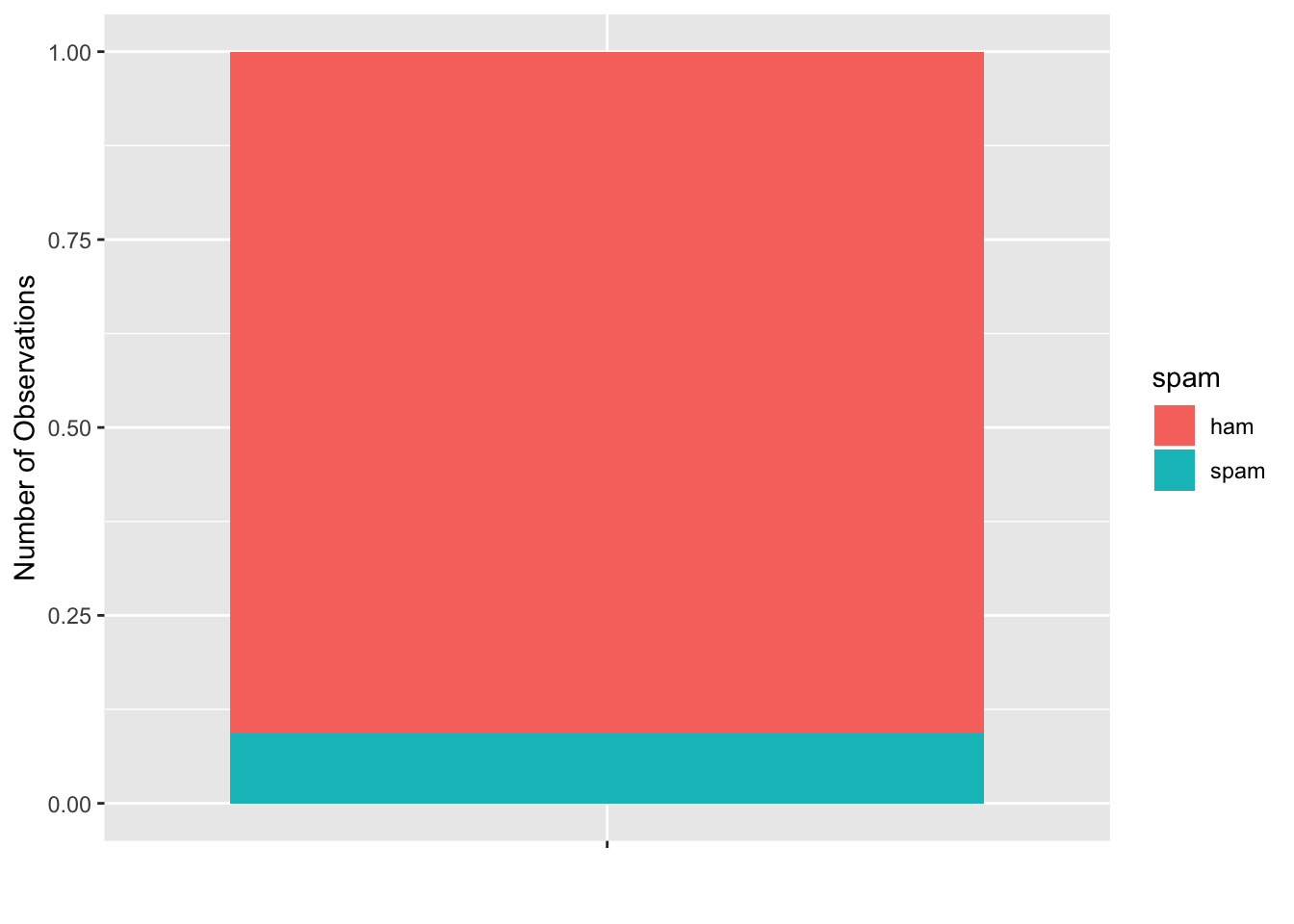
(sum(email$spam == 1)*100/nrow(email)) %>%round(1) %>% paste0(.,"%")## [1] "9.4%"There are a multiple ways to address this class imbalance:
- Create folds with nearly identical class makeups in each CV fold
- Upsample the less frequent class
- Downsample the most frequent class
There are positive and negatives for both solutions. The most obvious being the downsampling. If we address the class imbalance by downsampling the most frequent class, we are effectively throwing away data. If we Up-sample the less frequent class, we’re not running a CV scheme with unique “folds” of data. I believe the best way to deal with the imbalance, is to keep the identical class make up in each CV. This is trivialy done with createFolds in the package caret
set.seed(4121)
f1 <- createFolds(email$spam, k = 3)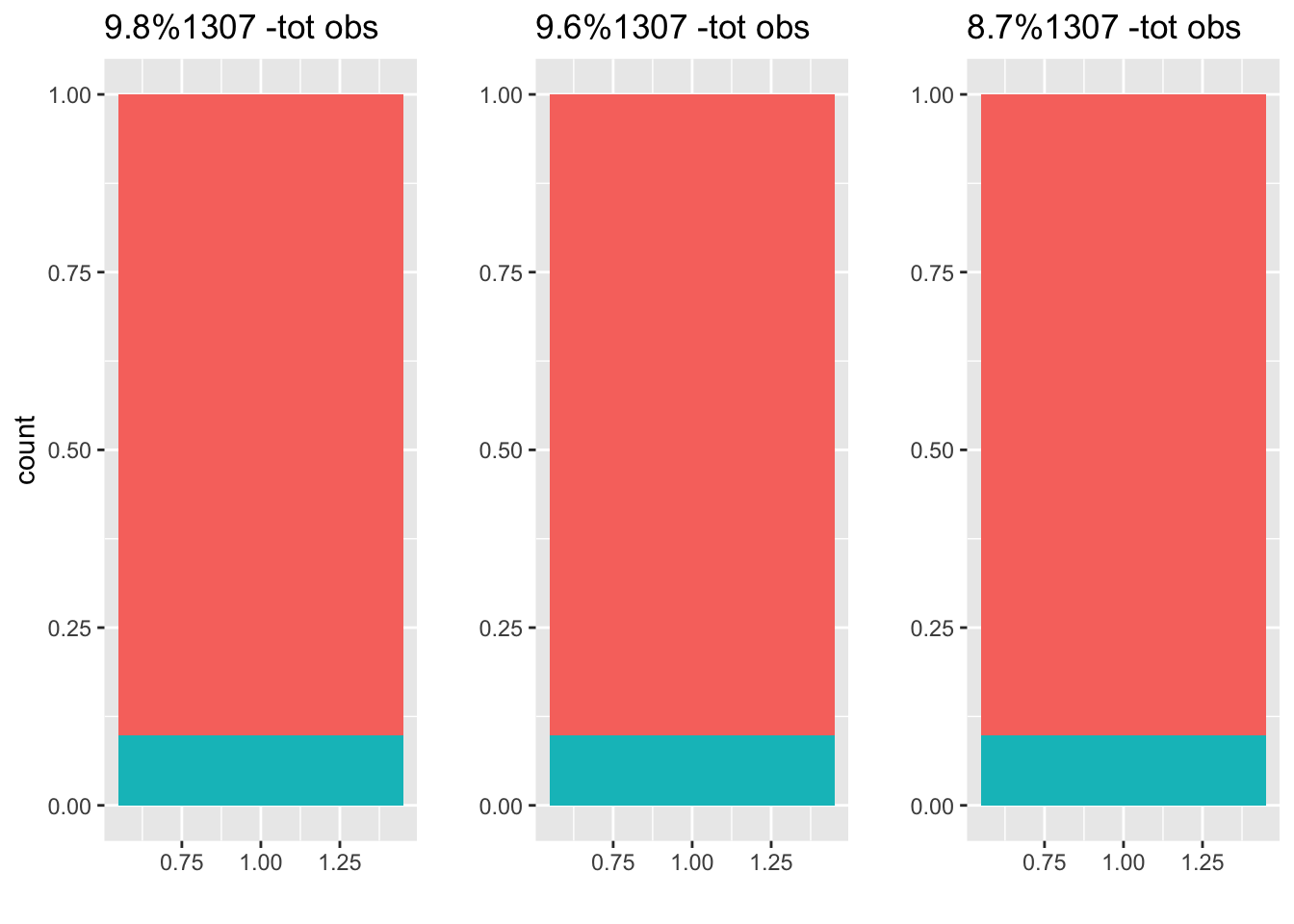 The plot above shows our 3 folds (split datasets), and the percentage of spam included in each. The proportion of spam/ham is very similar to our entire dataset, so we don’t anticipate any bias using this method. It’s important to note that 3- fold cross validation isn’t usually used, the standard is 5 or 10 fold cross validation. I’ll be arbitrarily using 5-fold cross validation in this article.
Generalized linear model
Let’s create a GLM utilizing caret with 5-fold cross validation. First, we need to tell our model, what indexes to use for each individual fold. We do this by using the createFolds function as we have done previously. Before running our model, we have to initialize a trainControl object. This controls the computational nuances and outputs on the model we run while using the train function in caret. I have supplied arguments for summaryFunction, classProbs, verboseIter, savePrediction, and finally index. I have noted their purpose in the code markdown below.
## Creating Folds
mFolds <- createFolds(email$spam, k = 5)
## Initializing a trainControl object.
mControl <- trainControl(
    ## We select twoClassSummary because our response variable is binary (spam/ham)
    summaryFunction = twoClassSummary,
    ## Are we interested in computing the class probabilities of each prediction? Yes.
    classProbs = TRUE,
    ## This is optional, and asks if we wish for the computation to be verbose while training.
    verboseIter = FALSE,
    ## Should we save the predictions of the holdout for each resample? i.e the fold we test. Sure.
    savePredictions = TRUE,
    ## Indexes for each fold.
    index = mFolds
)
modelglm <- train(spam ~ ., data = email, method = "glm",metric = "ROC",trControl = mControl)
The model training call takes 5 arguments. The formula: spam ~. indicates that we want to train the model using all 18 of the input variables. data is our set, method describes the ML method we wish to utilize, metric describes the metric used to select the optimal model, and trControl indicates which trainControl object we wish to use for training.
print(modelglm)## Generalized Linear Model
##
## 3921 samples
## 18 predictor
## 2 classes: 'ham', 'spam'
##
## No pre-processing
## Resampling: Bootstrapped (5 reps)
## Summary of sample sizes: 783, 784, 785, 785, 784
## Resampling results:
##
## ROC Sens Spec
## 0.8703169 0.9868459 0.1668617To assess the accuracy of our model, three metrics are given, ROC, sensitivity and specificity, right now is a great time to introduce the latter two. Sensitivity and Specificity. Sensitivity is otherwise known as the True Positive Rate (TPR), Specificity is also known as True Negative Rate (TNR)
Mathematically, they can be expressed as:
\[ TPR = \frac{TP}{TP + FN} \\ TNR = \frac{TN}{TN + FP} \]
Our model gives us a value for ROC AUC (Area Under Curve), Sensitivity and Specificity using a default threshold probability of 0.5. Furthermore, our accuracy is only slightly better than a naive model where we predict every email is ham.
paste0("modelglm accuracy: ", sum(predict(modelglm,email, type = "raw") == email$spam)/nrow(email))## [1] "modelglm accuracy: 0.914817648559041"paste0("naive model accuracy: ", sum(email$spam == "ham")/nrow(email))## [1] "naive model accuracy: 0.90640142820709"In this situation we’re interested in both the accuracy of the model, and minimizing false negatives. If a spam email gets marked as ham, it’s not the end of the world but we’d like a model that minimizes ham being marked as spam. After all, isn’t it annoying when you’re sent an email and after looking through your entire inbox, you find it was marked as spam? That’s exactly why we’d like to minimize false positives and maxiize true positives. In order to better understand ROC curves, probability thresholds, and their effects on TPR, TNR, and model performance lets give a quick introduction to them.
Receiver Operating Characteristic Curves (ROC curves)
ROC curves plot the threshold line in True Positive (TPR) vs False Positive (FPR) space. Each point on the line is a unique value for our probability (P) threshold, and it illustrates the values we should expect for FN and TP. A perfect model has a unit area under the curve (AUC = 1), and a useless model is represented by a line across the diagonal with half a unit area. Here is the ROC curve for the model we just trained:
colAUC(predict(modelglm,email, type = "prob")$ham, ifelse(email$spam =="spam", 1, 0), plotROC = TRUE) 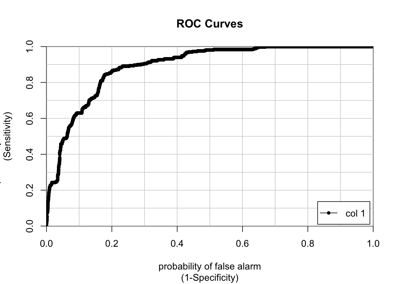
##              [,1]
## 0 vs. 1 0.8914881
rocmodelglm <- roc(email$spam,predict(modelglm,email, type = "prob")$spam)As you can see, the AUC value of our model is 0.89. This value is impressive, but it could use some improvement. Let’s plot the Specificity & Sensitivity against the threshold value.
cbind(rocmodelglm$thresholds[-c(1)], rocmodelglm$specificities[-c(1)],rocmodelglm$sensitivities[-c(1)] ) %>% as.data.frame() %>% ggplot(aes(x = V1, y = V2, color = "Specificity")) + geom_line() + xlab("Threshold") + ylab("Specificity/Sensitivity") + geom_line(aes(x =V1, y =V3, color = "Sensitivity" ))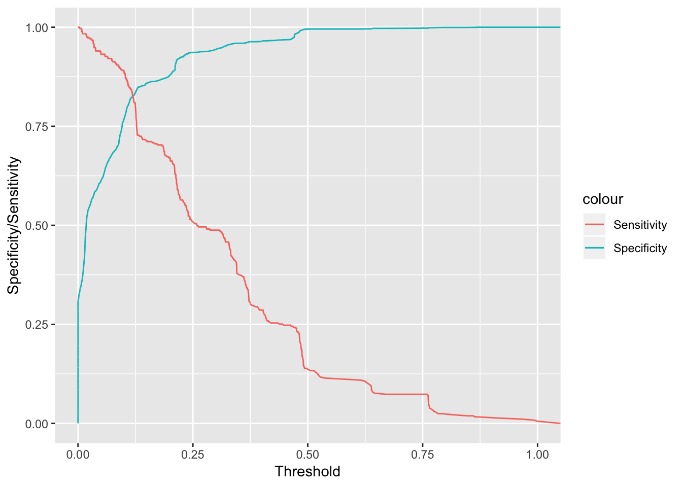
What exactly does this plot tell us? Well, if we choose higher thresholds in the probabilities given by our model to distinguish spam & ham, we will maximize specificity which means we’ll reduce the occurences of false negatives (ham email mistakenly marked as spam). Unfortunately, since our model isn’t that great this means that we’ll also lower the sensitivity of our model, allowing more spam to pass through our filter thus being mistakenly marked as ham. Let us go ahead and compare this with a random forest model using ranger.
Comparison with Random Forest
model <- train(spam ~ ., data = email, method = "ranger",tuneGrid = expand.grid(.mtry = 1:5, .splitrule = "gini", .min.node.size = c(10,20,30)), num.trees = 150
, trControl = mControl)
Fortunately, we don’t have to declare our traincontrol object, or our folds. We can just go ahead and utilize the same objects to train this model. We declare a grid to train on, with discrete values of mtry between and including 1-5, our splitrule is gini, and mid node sizes of 10,20, and 30.
print(model)## Random Forest
##
## 3921 samples
## 18 predictor
## 2 classes: 'ham', 'spam'
##
## No pre-processing
## Resampling: Bootstrapped (5 reps)
## Summary of sample sizes: 783, 784, 785, 785, 784
## Resampling results across tuning parameters:
##
## mtry min.node.size ROC Sens Spec
## 1 10 0.8813549 1.0000000 0.00000000
## 1 20 0.8747827 1.0000000 0.00000000
## 1 30 0.8735811 1.0000000 0.00000000
## 2 10 0.9027332 0.9981008 0.03474960
## 2 20 0.9004383 0.9977490 0.03681828
## 2 30 0.8989455 0.9992965 0.01841843
## 3 10 0.9083798 0.9928952 0.19623413
## 3 20 0.9061664 0.9949352 0.14375798
## 3 30 0.9043541 0.9949352 0.12199392
## 4 10 0.9072318 0.9873382 0.28075039
## 4 20 0.9051108 0.9905739 0.23234195
## 4 30 0.9023422 0.9928249 0.17919482
## 5 10 0.9048101 0.9861424 0.32565067
## 5 20 0.9032558 0.9886745 0.27184649
## 5 30 0.9005458 0.9898000 0.22482645
##
## Tuning parameter 'splitrule' was held constant at a value of gini
## ROC was used to select the optimal model using the largest value.
## The final values used for the model were mtry = 3, splitrule = gini
## and min.node.size = 10.Let’s go ahead and plot the ROC curve.
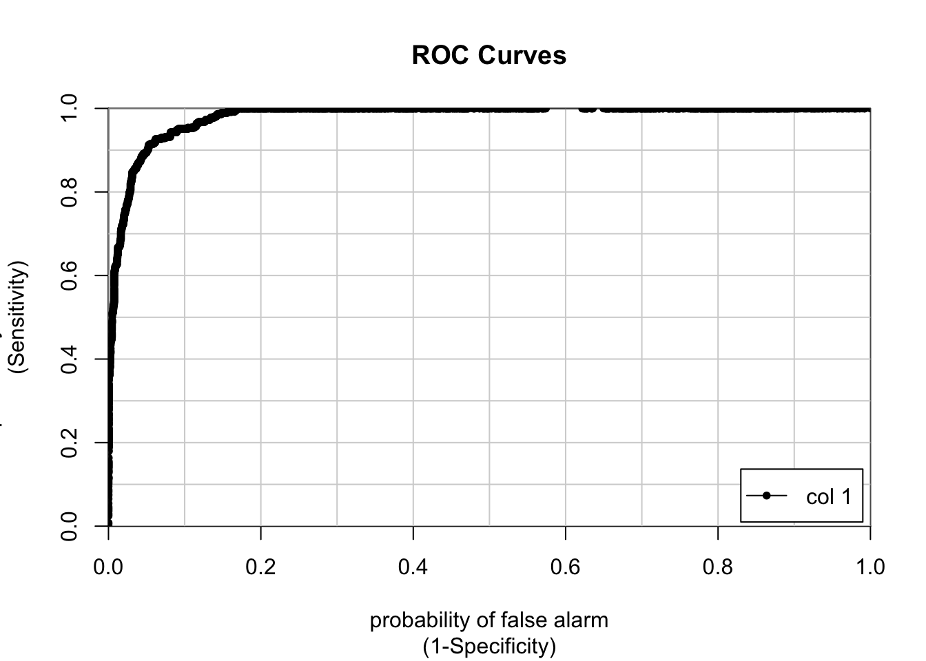
##              [,1]
## 0 vs. 1 0.9815911
This is a tremendous improvement on our glm model. We can see that our AUC is around 0.98 which is great. How does the specificity and sensitivity vary across probability thresholds?
cbind(rocmod$thresholds[-c(1)],rocmod$specificities[-c(1)],rocmod$sensitivities[-c(1)] ) %>% as.data.frame() %>% ggplot(aes(x = V1, y = V2, color = "Specificity")) + geom_line() + xlab("Threshold") + ylab("Specificity/Sensitivity") + geom_line(aes(x =V1, y =V3, color = "Sensitivity" ))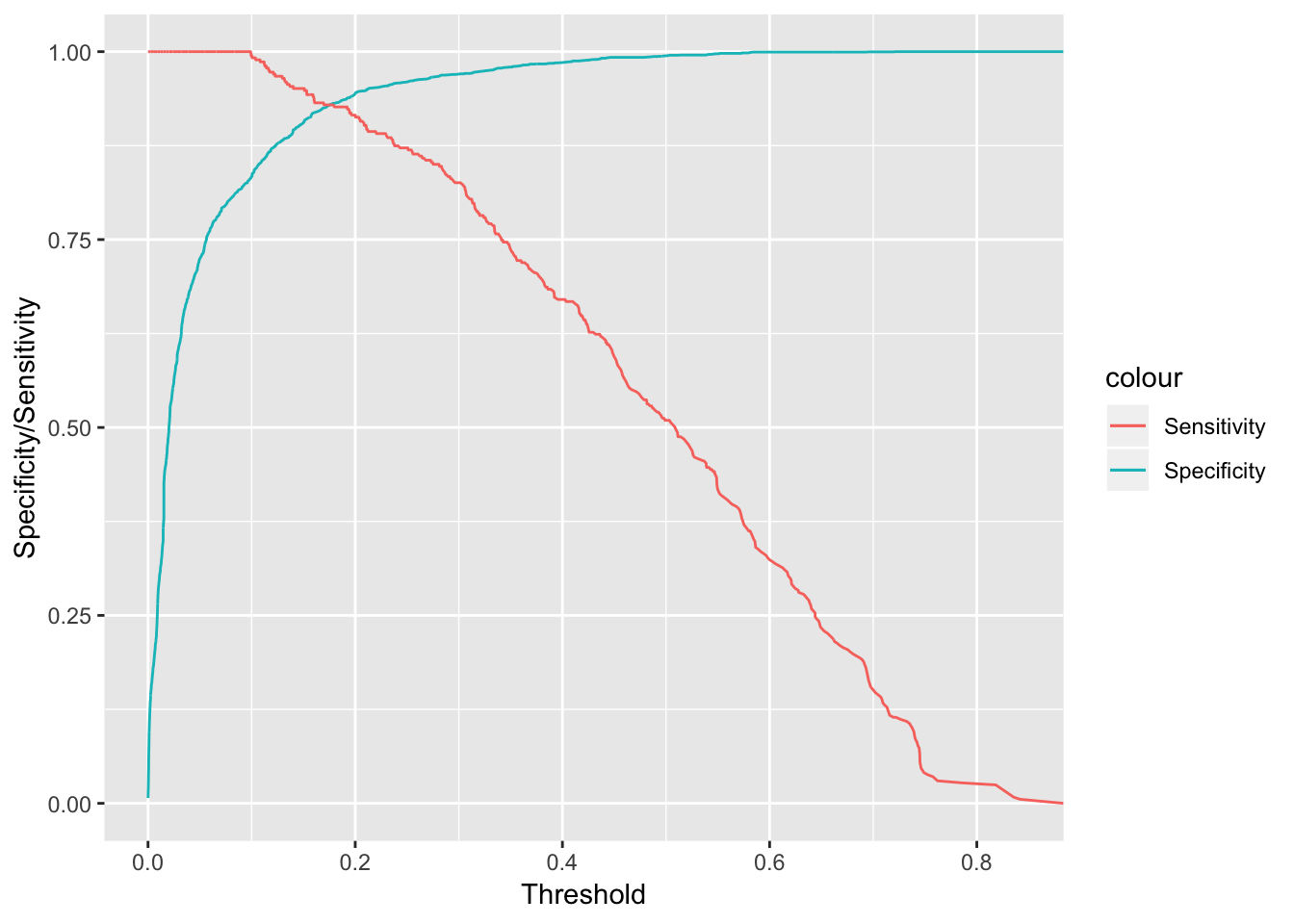 This is a pretty effective model for filtering out spam. We can see that for a pretty moderate probability threshold around 0.5, we have a high specificity, which filters out false positives. Additionally, our sensitivity will be considerably higher than our base GLM model, so we expect less spam to flow through to our inbox. This is definitely more robust.
Let’s plot the ROC curve of both the random forest and GLM model:
cbind(1-rocmod$specificities[-c(1)], rocmod$sensitivities[-c(1)], 1- rocmodelglm$specificities[-c(1)], rocmodelglm$sensitivities[-c(1)]) %>% as.data.frame() %>% ggplot(aes(x = V1, y = V2, color = "ranger (RF)")) + geom_line() + geom_line(aes(x = V3, y = V4, color = "glm ")) + xlab("1 - Specificity") + ylab("Sensitivity") + labs(title = "Ranger (RF) Vs GLM ROC Curves")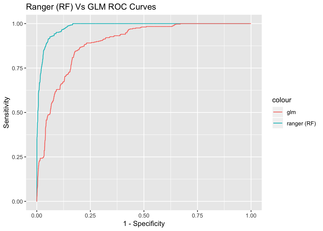 As you can see, if we choose lower probability thresholds to filter out spam, we can increase the specificity, while still maintaining a fair bit of sensitivity. This makes our random forest model more robust.
Wrap up and future work.
While GLM models are more intuitive to understand, and are often more robust, they can be computationally expensive. I hope I have demonstrated a great starting-off point for building any machine learning models you’d like to learn, and also demonstrated a better sense of how to evaluate such models. Random Forest models aren’t limited to dichotomous variables, while GLM sort of is (at least out-of-the-box). A great idea for a future project would be to evaluate our model on real email corpuses by creating a data pipeline that parses some of these variables with ‘Regular Expressions’. I might do a blogpost later on that, but farewell for now!